Microsoft Power BI Series
Power BI Data Visualization Best Practices Part 8 of 15: Bar Charts
 7172
7172 Power BI Training is a step in the right direction for you to improve your company’s management. It is viewed highly in business environments. How? Let’s find out together. A great tool for data analysis and connection. Microsoft Power BI is used by successful companies globally with the likes of Cerner, Metro Bank and Cummins in the list. Microsoft Power Business Intelligence (BI) helps people connect with each other through important data analysis for better business management. Put simply, it is definitely vital to your business’ success.
In today’s article, we talk about Bar Charts and their uses. Take a look:
- What are Power BI Bar Charts?
- What is the importance of Bar Charts?
- Bar Charts’ Characteristics
- Most common uses for Bar Charts
- Best Practices for using Bar Charts
- How to Create Bar Charts in Microsoft Power BI Tutorial?
- Pros and Cons of Bar Charts
- Some extra considerations (like the ideal Microsoft Certification for Data Visualization)
What are Power BI Bar Charts?
When dealing with business reports, one must make sure that data is understood quickly and effectively. Companies pay huge sums of money for the ‘perfect business report’. So, Data Visualization proves to be rather useful according to current standards. Using different types of visuals to represent data (mostly in graphical forms) is what being dynamic is about! Microsoft BI is that dynamic tool that has already established different types of visuals into its system. One of these visuals is a Bar Chart.
In a Bar Chart, data takes the shape of ‘bars’ to represent information, with these bars varying in length and height. All of this is based on the information that we accumulate and need for it to show.You can do a lot more than that, though. We can organize Bar Charts to represent figures into the same categories. Also, we can make comparisons between them. On top of that, we could further add sub-categories into the same bars, and add new layers of utility to these graphics.In short, Bar Charts are easy to understand and are adaptable. Mostly, because they are the most used data visuals in organizations. They are an easy-to-use tool for Data Analysts, and improve company procedures and processes all the time.

What is the importance of Bar Charts?
One of the reasons Bar Charts are relevant in business reports nowadays is because they are extremely easy for ‘adjusting’ information. By this we mean that we can change, organize and design Bar Charts in various ways. This, to best fit the message we are trying to get across. They are also great for comparing layers of information in a single, well-designed graph.
By this, you save an ample amount of time and effort while improving the decision-making processes of your company. The axis format also helps measure progressive factors, like time. Multiple elements with some correlation, such as departments within the same company too.
Bar Chart Characteristics in Microsoft Power BI
Let us now mention nine most important characteristics and features Bar Charts have in Microsoft Power BI:
- Data Binding: Data you bind acts like a Field well in Power BI.
- Adding Data Roles: You can assign roles to your data such as pre-established ones: displayName, name, and Also, you have the option to customize them if there’s a need.
- Adding Conditions: In Power BI, you can define conditions to your Bar Charts, within your This way you can set how many fields each field well can bind.
- Defining visualTransform: Another characteristic Bar Charts have in Power BI is DataView. It is a structure to your visual, and it has the queried data that we are going to visualize. Then, visualTransform lets you convert DataView into a view model your visual will use.
- You can add Color: You can represent each data point with a different color, while also having access to colorPalette service, available on
- Adding a Slider Control or Tooltips: Tooltips helps us display a textual element with a title, a value in a given color and opacity at a specified set of coordinates.
- You could add Selection and Interactions: This characteristic allows users to interact both with your visual and other visuals.
- Adding Static Objects: You can add objects to the Property pane to customize your Bar Charts further. Things like user interface changes; or data queried changes.
- We can add Databound Objects: Similar to Static Objects; except these deal with data selection, like changing the color associated with the data point, etc.
Common Uses for Bar Charts
Comparing Many Variables
Since Bar Charts are adaptable, most of the times we use them to compare two or more groups of information between variables. Basically, the list of variables can go as far as you want. Here is a complete guide to Bar Charts for your ease. Compared to a Doughnut Graph, for example, you are not limited to using the space that only the circle allows you to use. With a Bar Chart, you can place one bar after the other. For example, we can show and compare data coming from two different stores on two different dates, using the same graph.
Measuring Sub-Categories
Thanks to Stacked Bar Charts, we are able to see how sub-categories influence and add value to other categories. As an example, let’s say we want to compare the price of materials we need in order to make certain products. Maybe we have an option to build two types of chairs: metal and wooden. Our wooden chair model would be more expensive than our metal one.
However, when we look at the graphs, we notice that wood is not the most expensive material but the particular brand of ‘glue’ we use. Thanks to this comparison, we can see how much the cost of glue influences the price of our wooden chairs. Bar Charts are extremely useful for qualitative data, and you can place sub-categories like color, address, materials and resources all in one place. You can measure all these on the other side of the Bar Chart, with statistics to show how to take decisions based on the accumulated final comparisons.
Using Different Colors for Different Categories
Following the example of showing more than one store, you could also color code these Bar Charts. In graphs, you can show each bar as a different store, with a different color. In this way, consequently, you know that blue bars refer to Store A; and the red bars are Store B, and so on.
Setting a Highest-From-Lowest Scale
With Bar Charts, you can organize data in a best-to-worst scale, or in a highest-to-lowest one. You can organize your data in such a way that these differences are easier to notice. This way, it is better to make a hierarchy between (for example) performance. You can set your bars to show the highest performance from all your stores (top to bottom). This would show you what store is giving your organization the most returns on your investment.
Explaining Periodic Changes
If we compare Bar Charts to Doughnut Graphs, just as an example, we have the option to organize data in a periodic-based structure as well. This is made possible when we use Bar Charts to show what changes have taken place in our company over a period of time, and how long (time duration) it takes our organization to meet certain goals. Timelines are best described in Bar Charts, such as overviews of monthly sales from previous years. Months on our axis and years as categories works easily for Bar Charts.

Microsoft Power BI Training: Best practices for Bar Charts
Moving forward in our Microsoft Power BI Training, let’s get acquainted with the best practices for Bar Charts:
-
Start the Y-Axis at 0
When setting up the scale, we should always portray where the 0 value is on the axis.
-
Proper spacing between Bars
The spacing between Bars should neither be too wide nor too narrow. You should be able to spot the difference from one bar to another, without placing them too far apart (wasting space).
-
Horizontal Labels and their Usage
Although we are used to vertical bars, horizontal bars allow us to place their labels horizontally too. In this way, it is easier to read them overall.
-
Data Order
We should organize data in descending or ascending order (from highest to lowest value) or vice versa. Unless we are organizing time-based data, this applies to almost everything.
-
Different Colors for simple Comparisons
If we need to compare two values (such as maximum income and minimum income) together, we should be using two different colors. One color should be used for the maximum value, and the other for the minimum value.
-
Color Variations for showing Groups
Colors are also used to (visually) group bars with each other. This being said, color needs to be used for coding. Avoid using different colors for every bar if you don’t have a reason to back it up.
-
Using Color to highlight particular data
Try to avoid using too many colors for unnecessary divisions, and use colors to highlight meaningful data instead.
-
Variability Elements
Information is not always in exact, specific numbers. In these cases, you can use graphic elements above your Bars such as ‘whiskers’, to let people know that the shown data could move from one amount to another.
Bar Charts Tutorial on Power BI
Moving one step ahead, let’s go over a simple tutorial on how to create Bar Charts in Microsoft Power BI. The ‘Bar Chart’ visual is already present in the Visuals panel; we just have to select it to begin. Consequently, we are going to go over the Format section to set up our graph:
| General Section: Here, we can change the X and Y position, as well as width and height of our Bar Charts |  |
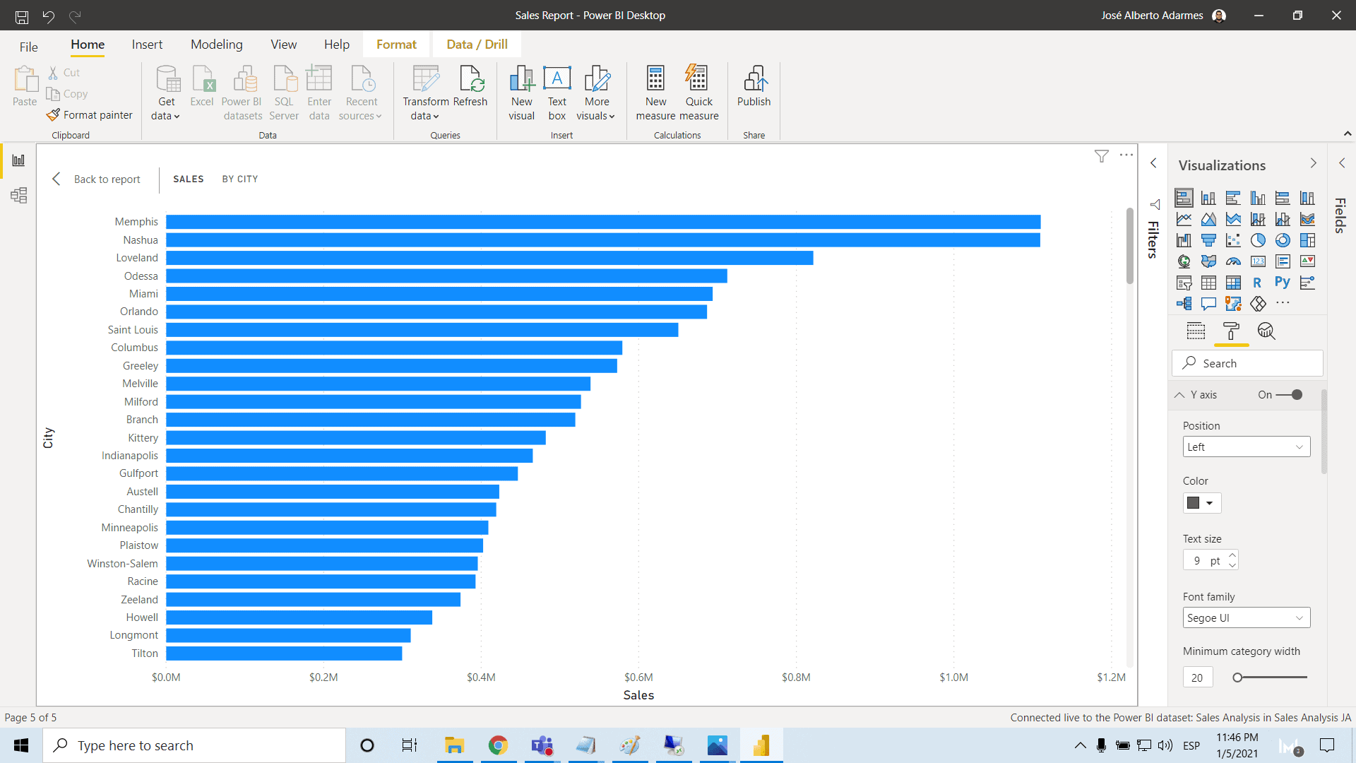 |
Y Axis Format: In this section we can format the position, color, text size, font family, minimum category width, maximum size, and inner padding, and we can toggle title on X Axis Format: Here, we set scale type, color, text size, font family, display units to thousand, value decimals, and title |
| Data Color Format Section: This section helps us set color to specific data, or automatically make a diverging from minimum to maximum |  |
 |
Data Labels Format Section: When we toggle these on, we can show information nest to our bars in our graphs. Here we can also format color, display units, value decimals, position, overflow text, text size, font family, show background, background color, and transparency |
| Plot Area Format Section: Then, you can add images as background of your graph. You can also set things like transparency | 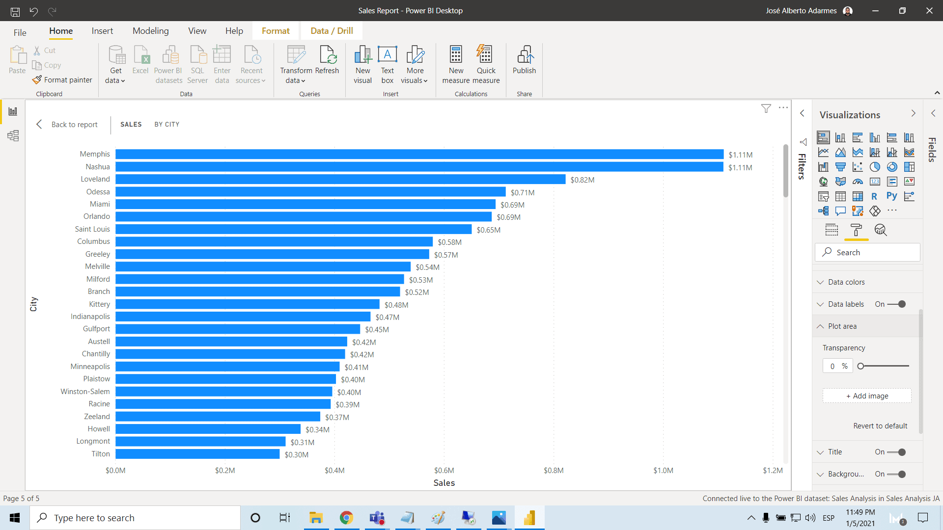 |
 |
Title Format Section: You can toggle title on, and set things like title text, font color, background color, alignment, text size, and font family |
Pros and Cons of Bar Charts
Of course, Bar Charts have their fair set of advantages and disadvantages, like all other Data Visualizations.
As authentic as one can get with research, we bring you some of the pros and cons for choosing Bar Charts for business purposes.
Pros of Bar Charts
- We can portray data categories in a frequency distribution
- Also, you could use large amounts of data in a single graph
- We can add sub-categories
- Trends are easier to spot
- It is easier to understand, from a visual point of view
Cons of Bar Charts
- Most of the times, it only shares totals or results; not an entire cause-and-effect sequence
- Sometimes a Bar Chart needs ‘extra’ explanation
Some Extra Considerations
Ideal Job Role
Power BI and data visualization is necessary in today’s digitalized world.Furthermore, this software is made for people that are in the business of making data easy to understand, using data models to drive meaningful business value.
For this reason, a Microsoft Certified Data Analyst would be the ideal job role here. A Data Analyst is someone that maximizes the value of a business’ data, using Power BI.Other than all the facts we have already mentioned before, they also clean and transform data, using advanced analytic capabilities through visualization.
DA-100 Exam: Analyzing Data with Microsoft Power BI
The DA-100 Exam is one of the prerequisites for the Microsoft Data Analyst Associate Certification.
It focuses on analyzing data with Microsoft Power BI, and we are here to give you a quick overview on the subjects it evaluates:
- Preparing Data: This section goes from getting data from different sources to cleaning, transforming and loading it. It also teaches us how to profile data
- Modeling Data: This one is about designing and developing a data model. It also includes creating measures using DAX and optimizing model performance
- Visualizing Data: This section evaluates people creating reports and dashboards. It also talks about how to enrich reports for usability
- Analyzing Data: Here, candidates learn how to enhance reports to expose insights and perform advanced analysis
- Deploying and Maintaining Deliverables: This section goes over managing datasets and managing workspaces
Microsoft Power BI Training & Bar Charts
Last but not the least: let us go over Microsoft Power BI and Bar Charts.
Where Do You Get This Microsoft Power BI Training?
Microsoft has many useful and free resources for your learning. For your feasibility, you can take a look at their guide on how to build a bar chart in Power BI. Through this, you are able to bind data, add data roles and conditions to DataViewMapping. This further teaches defining and using VisualTransform. It has sections on color selection, interactions and static objects.
If you wish to take a step further, you can look for Instructor-led training.
This is where you invest in getting a guided-learning experience. The main benefit you derive out of this investment is the knowledge and experience shared by your instructor. Also, the added role of quizzes and assessment modules to help you at every turn. As a result, not only surface-level information but an enhanced curriculum is shared and results in an overall better learning experience (and technical support).
Summary: Bar Charts in Microsoft Power BI
In this part of our series, we have discussed the Usage and Analysis of Bar Charts. Our suggestions will help your business to create reports and to predict the best practices suitable to your needs. Bar Charts are a great way to represent data by using graphs. They are adaptable and one of the most popular and easy ways to read graphs.
Conclusion: Microsoft Power BI – The Best Practices for using Bar Charts
Microsoft Power BI training is a requirement in the modern business world.
In addition, we sincerely hope that you enjoyed this part 8 of our exciting series on Microsoft Power BI Data Visualizations, and no worries, we will back soon with more. In short we aim to provide quality service at all times. Meanwhile, you can check all our courses here. Moreover, if you need to reach me, you know how to get in touch by reaching out to me here. – Brandon Ahmad, founder of Instructor Brandon and Dynatuners.

