Microsoft Power BI Series
Power BI Data Visualization Best Practices Part 5 of 15: Pie Charts and Doughnut Charts
 7279
7279 
Dec
Moving on in our Power BI Data Visualization Series, it is now time to cover two other types of charts in Power BI.
When it comes to Doughnut Charts, you can already tell the kind of Data Visualization this one brings. At this point in our Power BI Data Visualization Series, it is clear that it is one of the most important tools when it comes to bringing data to life.
Giving meaning to all sorts of information with Pie and Doughnut Charts can be a game-changer for important decision-making in your business.
In part 5 of our series, we are going to walk you through these two simple yet powerful visualizations in Power BI.
Here’s a list of what we will cover in this article:
- What are Pie Charts?
- When to use Pie Charts in Power BI?
- Best Practices for Pie Charts in Power BI
- What are Doughnut Charts?
- How to Create a Doughnut Chart in Power BI?
- Pros and Cons of Doughnut and Pie Charts in Power BI
- Conclusion
Let’s start with Pie Charts, and how they’re important in Data Visualization.
What are Pie Charts?

Inspired by the shape of a ‘Pie’, William Playfair (businessman, engineer, and economics writer) from Scotland created the first known pie chart in 1801.
A little history lesson here: he is also credited with creating a Bar Chart. 219 years later, his data visuals are still as relevant as before.
Pie Charts
Pie charts, as their name suggests, are circular visualizations that display the values of the different categories of a total. Every piece-or wedge of the circle represents each category; just like a pie sliced in several pieces.
Example:
Imagine you are about to serve dessert after family dinner and you cut the Pie in different sized pieces. The whole Pie is the Total, and the sliced pieces are the representation of the parts that form that total.
Another example is mentioned below:
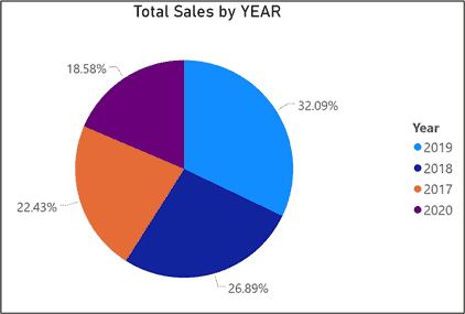
A survey asked a total of 104 people on what Ice Cream flavor they preferred out of three options (Vanilla, Strawberry, and Chocolate). The Pie Chart shows the preference of Ice Cream flavors for those people.

As you can see in the picture above, these visualizations don’t have axes.
The whole circle represents the total-in this case 104 people (100%)-and the wedges are the number of people divided by the three different categories of the flavor they chose as their favorite.
With a quick glance, you can determine that the category represented in blue, in this case, chocolate, is the winner of the preferred flavors.
Chocolate with 60%, Vanilla with 21%, and strawberry with 19% create the sum of the value 100%.
Let us now talk about the best time to use Pie Charts.

When to use Pie Charts in Power BI?
As tempting as they might sound, you cannot use Pie Charts every single time that you want to use a visual. As we mentioned previously in this Series, all visualizations must be used according to the information that you want to display.
For instance, Pie charts are useful when you need to display data that is classified into nominal or ordinal categories. Let us stop here a moment… What are these categories?
According to the ‘Type of Data’
For starters, data can be categorized in Nominal Data or Ordinal Data.
Nominal Data represents descriptive or qualitative information such as country of birth or education level.
On the other hand, Ordinal Data is very similar, but the difference between these two is the fact that Ordinal Data can be ranked.
Remember the Ice Cream flavor Survey? Well, imagine a survey, but in this case, people have to rank each flavor as “very good”, “good” and “not so good”. See the difference?
Another thing to consider about Pie charts is that they are commonly used to display percentage or proportional data. Usually, the percentage represented by every category is right next to the corresponding piece of the Pie Chart. These Charts work best for values around 25%, 30%, or 75% because it is easier for the reader to visually process these percentages in a Pie Chart than in another type of Chart: like a bar or a Basic Area Chart.
Again, the Ice Cream Pie Chart!
In that chart, you can see the percentage of each category, side by side.
In this other chart, however, you see percentages but instead of being displayed inside the chart, they are displayed outside. What exactly are the similarities between these two charts? They both have less than 6 categories.
When you need to show around 6 categories or less
Why?
Usually, when you have more than 6 categories, it gets difficult for the eye to distinguish between the different sizes of each part of the Chart. This is what makes it difficult to interpret; so use the Pie Chart when you have around 6 categories or less (for good visualization).
SUMMARY:
- Pie Charts were invented by William Playfair.
- They are circular visualizations that display values of different categories that make up a total.
- Every piece of the chart represents different categories.
You can use a Pie Chart:
- When you need to display data that is classified into nominal or ordinal categories
- You have to display percentage or proportional data
- If you have less than 6 categories to represent
To learn more about creating powerful Data Visualizations in Power BI, visit Instructor Brandon’s website and get inspired with our Dashboard Ideas.
Best Practices for Pie Charts in Power BI
Category Sizes:
As you can see in the previous examples, Pie Charts can give you a solid visual representation of the data when all categories show some variation in size.
Having said that, when the categories have similar sizes, Pie Charts can end up looking a bit clustered. This makes Pie Charts difficult to interpret, as the eyes aren’t easily able to distinguish between categories.

For example, take a look at these Pie Charts. They all have similar sizes between categories and without a displayed amount to guide you; it is very difficult to distinguish which categories are bigger than the others.
In this case, you should consider another type of Chart that allows you to present the information more effectively: like a Bar Chart or other types of visualizations.
Order of the Categories
Most people read from top to bottom; which is why the categories of a Pie Chart are arranged clockwise in order of magnitude (from wider to narrower).
Whenever you need to display a category that summarizes data like an “other type’ ‘ or “other answers’ ‘ category, even if it is not the narrower piece of the chart, you need to display it last (in order).
Pro Tip:
Color the categories differently so that they grade from dark to light tones as you move from the first category to the last one.
Number of Categories
As mentioned earlier, Pie Charts work best in less than six categories. The human brain cannot compare values side by side if the information is clustered.
Data Quantities
Try to incorporate quantitative data in your chart nicely. If you are not using percentages, you need to avoid introducing more than three numerals when displaying numbers.
Pro Tip:
When displaying large numbers, reduce the quantities.
Use 2.5 million instead of 2,500,000.
Data Labels
Avoid cluttering your Pie Chart; don’t add unnecessary labels.
How to make your Pie Charts better in Power BI?
STEP 1: Think of Color
When it comes to making a great Pie Chart, you need to think of color! Use bright colors to make your most important value stand out. For the rest of the values, use variant shades of one color. Rainbow colors tend to distract readers from comparing the categories.
STEP 2: Be Careful with your labeling
As we mentioned before, avoid cluttering your Pie Chart with unnecessary labels. Consider labeling the longer categories outside the Pie Chart to avoid any cluttering. You can use the color of the categories to display the labels outside the Pie Chart.
STEP 3: Compact your smaller categories
If you have a bunch of small categories, consider grouping these together in one big category, and name it “others”. This will give a cleaner look to the chart, even though it will make it less precise. In case you need to display detailed information, you might need to consider using a different visual As Stephen Fews would say: Save the pies for Dessert.
Now that we have walked through the Pie Chart, it is time to talk about its sibling: the Doughnut Chart!
The Doughnut Chart, in a crux, is essentially the same visual but with a hole in the middle.
What is a Doughnut Chart?
A Doughnut Chart is very similar to the Pie Chart. According to Microsoft “it shows the relationship of parts to a whole. The only difference is that the center is blank and allows space for a label or icon”.
This chart is often preferred over the Pie Chart because of its space efficiency, as the hole in the middle allows you to add information. Here, for example, you can see that the space in the middle allows showing the total data:

Unlike the pie charts, Doughnut Charts can represent multiple series, and the number of rings can be increased. The more the rings, the more data can be added to the chart.
As the same principles apply to both charts, Pie Charts, and Doughnut Charts, we will show you how to create them using Power BI.
But first, let’s have a short recap of what we have learnt so far.
Summary:
- Pie Charts and Doughnut Charts are circular visualizations that display the values of the different categories of a total.
- Every piece of the chart represents a different category.
- Unlike Pie Charts, Doughnut Charts have a blank space in the center that allows for extra information and can have multiple layers.
Use these Charts:
- When you need to display data that is classified into nominal or ordinal categories
- If you have less than six categories to represent
- You have to show percentage or proportional data
Be careful with:
- Order of the categories
- Color usage
- Labeling
How to Create a Doughnut Chart in Power BI?
Using Power BI to create Doughnut Charts and Pie Charts is essentially the same; the only difference is that you will click on a different icon if you want to create one visual or another.
The following example was taken from Microsoft; you can see the original tutorial here “This tutorial uses the Retail Analysis sample PBIX file.”
Step 1: Select your report
From the upper left section of the menu bar, select File and click Open. Find your copy of the Retail Analysis sample PBIX file and open it in Report View![]() . Select this icon
. Select this icon ![]() to add a new page.
to add a new page.
Step 2: Create a doughnut chart
Start a blank report page. Then, from the Fields pane, select Sales and Last Year Sales.
Then, from the Visualizations pane, select the icon for the doughnut chart
![]()
to convert your bar chart to a doughnut chart. If Last Year Sales is not in the Values area, drag it there.
Note: If you want to create a Pie Chart instead, click on the Pie Chart Icon

Step 3: Add the Legend
In the Fields panel Select Item, then click on Category to add the information into the Legend area.
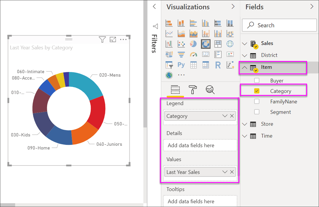
Additionally, you can start formatting your chart by adjusting the size and color of the chart’s text.
And there you go! How to create your own Doughnut Charts or Pie Charts in Power BI Desktop has been presented in this Blog Series.
Before wrapping things up with this part of our Power Bi Data Visualization, let’s take a look at the Pros and Cons of these visualizations.

Pros of Pie Charts and Doughnut Charts
- They are easy to read when made correctly
- Their round shape represents data visually as a fractional part of a whole, which can be interpreted easily by the human brain
- It allows the reader to see a data comparison and make an immediate analysis of the provided information
- You can visualize all information at a glance
- You can highlight certain values of each chart by manipulating the display
Cons of Pie Charts and Doughnut Charts
- These charts can become difficult to interpret when you have more than six categories
- They can get cluttered easily
- Take a lot of space
- When having similar quantities, it can be difficult to interpret the data
Conclusion
Pie Charts and Doughnut Charts are a double-edged sword; but at the end of the day, what Data Visualization isn’t? These visuals are a great way to present your data and can also be used to transmit information through either insightful reports or powerful Power BI Dashboards.
Go ahead and learn more about Power BI and its visuals to make the most out of your data with our Power BI Series.
There is much to achieve with Power BI visuals, and we have made sure that the most important lessons have been learned with this blog. Thank you for reading this article and we hope to see you soon. Don’t forget to contact us if you have any questions, our team will be more than happy to tend to you. – Brandon Ahmad, founder of Instructor Brandon and Dynatuners.
And as always, you are welcome to leave us a comment.

