Microsoft Power BI Series
Power BI Data Visualization Best Practices-Part 1 of 15: Basic Area Charts
 5486
5486 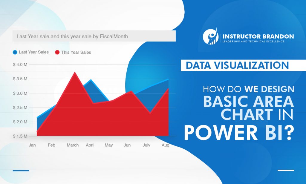
Dec
Once more, Microsoft has revolutionized new technology by offering tools such as Microsoft Power BI and the different visualizations it offers.
Adding life to your data with attractive and interactive visuals, Microsoft makes it easier to ‘adapt’ the strategy best suited to your organization. Microsoft Power BI offers solutions to sharing information, data and graphics; letting people participate in ‘real-time’.
Power BI offers a number of models for data visualization made for visual information, and we start off with Basic Area Charts and how they ride the wave of Business Intelligence.
Points to Remember:
In the first article, we will formulate a step-by-step guide to building a Basic Area Chart with Microsoft Power BI.
Let’s start with the basic questions:
- What is Power BI?
- What is Data Visualization and why is it important?
- How do you create a Basic Area Chart in Power BI and when do you use it?
- What are the Pros and Cons of a Basic Area Chart?

What exactly is Power BI?
Microsoft Power ‘Business Intelligence’ is a cloud-based business analytics service that provides a unique view of your most critical business data.
In short, it is used to create dashboards that facilitate decision-making. This information can be updated in an automated or manual way, allowing sharing reports through the tool itself.
In this way, Power BI allows you to move from a system with management tools (an ERP, a CRM, and other control tables in Excel) and a controller that crosses information between them.
Through Power BI, you can formulate management reports in Excel or paper; with the controller preparing the reports.
The dashboard here is equivalent in its function to the dashboard of a car, through which the manager receives information to drive his company more autonomously.
It is important to remember that this ‘crossing of information’ is free from ‘human error’ that always happens when a Business Intelligence System is not used.
You don’t have to wait any longer to create interactive reports: Power BI gives you access to data on-the-go with the native Power BI Mobile applications.
Power BI: A cloud-based Business Analysis Service used to create dashboards that can help organizations make decisions more quickly and easily. This allows you to cross information to/from different systems and generate a Power BI report with your most exclusive information.
What Is a Basic Area Chart in Data Visualization?
Data Visualization is the process of taking raw data and transforming it into graphical or pictorial representations such as charts, graphs, diagrams, pictures and videos.
These picture representations explain your data, allowing you to gain insights visually.
A Basic Area Chart is one of the data visualizations that you can use in Power BI and analyze data/prepare reports with.
‘A Visual World’: The Importance of Data Visualization
In a world where pictures and videos speak more than words do, we are dependent (today) on visuals.
Data Visualization makes it easier to gauge large reports or spreadsheets, once they are put into graphs or charts. A quick and easy way to convey concepts to end-users, you can now experiment with Data Visuals according to what is best suited for your company.
It can also:
- Clarify what elements influence ‘consumer behavior’
- Identify where you need to pay more attention (department)
- Guide you to understand product placement
- Predict sales volume

The better your points are visualized, the better you leverage information to end-users.
You might feel a little confused while deciding the correct data visuals for the data sets you have, and we will be discussing those later in the article.
Data Visualization: A process of taking raw data and transforming it into graphic or pictorial representations, so users can quickly analyze the data and prepare reports for business decisions. Data Visualization is a quick and easy way to convey concepts to end-users.
What is a Basic Area Chart in Power BI?
If you have ever worked with charts, you know that choosing the right one is a tricky business. Your choice depends more on the ‘kind of analysis’ you are targeting at, rather than the type of data you have.
An example:
Let’s assume you have your quarterly sales data for five years. If you want to facilitate a general comparison for your audience, you would use a column or bar chart.
However, if you wished to show the trends in how sales values changed over the years, you would be using a line chart or an area chart. The Basic Area Chart (also known as layered area chart) is based on the line graph.
The area between the axis and line is filled with colors to indicate the volume.
Area charts highlight the magnitude of change over time and can be used to draw attention to the total value in a trend.
When Can I Use a Basic Area Chart?
This display works best for ‘showing’ and ‘comparing’ trends over time.
They are an excellent choice for:
- Viewing and comparing the volume trend over a time series
- Individual series that represent a physically accounting set
- Comparing months and units of products sold
- Seeing increase or decrease in your followers on social networks (per week)
- Finding out the magnitude of a change
- Comparison of a small number of categories

“Area charts are a great option to showcase data that depicts a time-series relationship.”
The information in an area chart is plotted on the x- and y-axis; data values are plotted using data points (connected using line segments).
Area charts, therefore, are primarily used when the ‘magnitude’ of a trend is to be communicated (rather than individual data values).
The Basic Area Chart (also known as the Layered Area Chart) is based on the Line Graph. Area charts highlight the ‘magnitude’ of change over time and can be used to draw attention to the total value in a trend. It is the best choice to show data that depicts a time-series relationship.
How do you create a Basic Area Chart in Power BI?
Using a Microsoft example, we will explain a step-by-step process of creating a Basic Area Chart.
Pre-requisites for Power BI:
Download Power BI Desktop from the Microsoft website, which is free of cost.
After completing this step, download a test file called Retail Analysis sample PBIX file. After this process, you will be ready to utilize your data with never-before-seen visuals and data management.
Once you enter Power BI, do the following:
- From the upper left section of the menubar, select File > Open
- Find your copy of the Retail Analysis sample PBIX file
- Open the Retail Analysis sample PBIX file in report view
- Select the Yellow Tab to add a new page
We are ready to start.
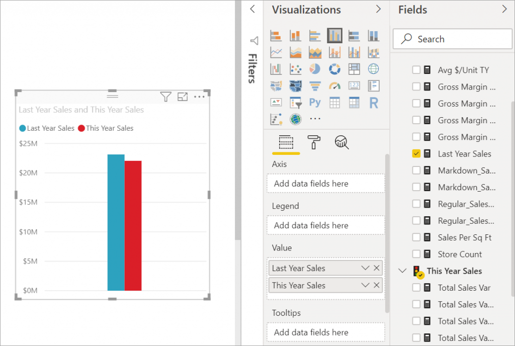
These steps will help you create an area chart that displays this year’s sales and last year’s sales by month.
Step 1: Last Year Sales vs This Year Sales
a. From the Fields panel, select Sales > Last Year Sales, and This Year Sales > Value
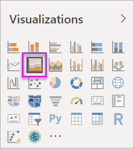
Step 2: Convert the Chart to a Basic Area Chart
b. Convert the chart to a basic area chart by selecting the Area chart icon from the Visualizations panel
Step 3: Select Time – Fiscal Month
c. Select Time > FiscalMonth to add it to the Axis well
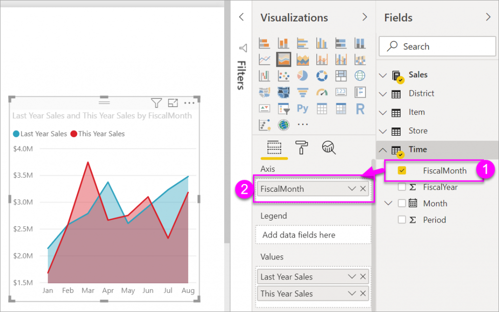
Step 4: Display Chart by Month
d. To display the chart by month, select the ellipses (top right corner of the visual) and choose Sort by month. To change the sort order, select the ellipses again and select either Sort ascending or Sort descending
Power BI Cross Highlighting and Cross-Filtering
To highlight an area on your chart, select that area (or its top border).
Unlike other visualizations, highlighting a basic area chart does not cross-filter the other visualizations on the report page.
However, area charts are a target for cross-filtering that is triggered by other visualizations on the report page:
- Try it out by selecting your area chart and copying it to the New Store Analysis report page (CTRL-C and CTRL-V)
- After this, select one of the shaded areas of the area chart and then select the other shaded area. You’ll notice no impact on the other visualizations on the page
- Select an element and it gets cross-filtered
And that’s about it!
It couldn’t be simpler than this; for innovating and keeping your organization’s data in order and easily accessible to everyone.
If you want to learn how to analyze your data with Power BI, do not hesitate to consult our Course DA-100T00-A Analyzing Data with Power BI where you can learn to manage all the data visualizations of this software.
What are the Best Practices for using Area Charts?
1.Include a Zero-Baseline
While a line chart is not restricted to a zero-baseline requirement, additional shading means that the ‘heights’ of colored regions will be used for comparison of each group’s values.
Therefore, like a bar chart, it is compulsory to have a zero-baseline against which the shading is performed.
An exception to this rule can come in when we compare two series in an overlapping area chart (with a change to the shading rule).
If we limit the shading to be between the lines, rather than from both lines to a common baseline, then we can zoom in on the vertical axis limits into the effect of interest without a baseline.
Shading takes a different meaning now, with the color indicating which group is a larger value, and the amount of color is the size of the difference.
2.Limit Number of Series in an overlapping Area Chart
The more series we have in an overlapping Area Chart, the more combinations of colors will appear when we overlap.
The fact is when you don’t relate the colors with a single group, the interpretation is a little bit tricky. Even with only three series, this is sometimes difficult to track.
There are three individual colors, three pairwise overlaps, and one color for all three overlapping groups.
Comparing two series is usually safe, even if one series is larger than the other.
As a general rule of thumb, if you’re thinking about using an overlapping area chart, limit yourself to two series and think about using a line chart.
As a result, this will make the comparison between groups clearer.
Pros and Cons of Basic Area Charts
Like everything else in life, the Basic Area Charts of Power BI do have positives and negatives.
If you still haven’t decided what type of Data Visualization you want to work with, here is a list of pros and cons of BAC’s to guide you better:
Pros of Basic Area Charts
- Trends are reduced at a glance, comparisons between different data series are quick to make
- Easy to generate due to the ‘direct jump’ from spreadsheets to the X and Y-axis
- Useful for representing different data ‘series’
- Facilitate the representation of continuous variables
- To represent timeless data (data unrelated to time)
Cons of Basic Area Charts
However, there are certain limitations that must be taken into account if you wish to represent data clearly and effectively:
- They are not suitable for representing a lot of data series
- They make the representation of ‘discrete’ values difficult
Important to realize Basic Area Charts are not effective for comparing values (due to hidden areas in layers). Power BI uses transparencies to indicate overlapping areas.
In this way, a BAC works well in two different areas:
- If you need to compare trends for more than 3 measurements, try using line charts
- When you wish to compare volumes of more than 3 measures, use the rectangle plots
Conclusion:
If you wish to have a tinge of uniqueness to your data representation, don’t hesitate in using Power BI.
In addition, it is important to keep the hindrances in mind whilst adding the uniqueness. There should be no confusion in interpreting the colors, the ‘type’ of the chart it is, and of course, misinterpretation due to overlapping.
This is exactly why the use of graphs should only take place when we are sure that the message given is clear and well-customized.
We are sure that, in this way, Microsoft has offered us the best option in boosting our professional resources.
Learn how to use Dynamics 365 to optimize your daily operations!
Thank you so much for learning how to create a Basic Area Chart-Power BI in Microsoft Power BI with Instructor Brandon.
We hope you have found the information relevant and innovative to today’s business-oriented world. If you wish to learn more about Data Visualizations in Power BI, contact us. Keep an eye out for the next blog where we talk about Stacked Area Charts. – Brandon Ahmad, founder of Instructor Brandon and Dynatuners.
And as always, feel free to leave any questions you might have in the comment section below, we will respond as soon as possible.

