Category Archives: Microsoft Power BI Series

Microsoft Power BI Data Visualization Best Practices Part 12 of 15: Slicers and Tables
Microsoft Power BI, by far, is one of the best pieces of digital technology applied [...]
Jan
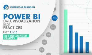
Power BI Data Visualization Best Practices Part 11 of 15: Key Influencers Charts
“If you can’t measure it, you can’t improve it.” This is a very important statement, especially [...]
Jan
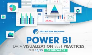
Power BI Data Visualization Best Practices Part 10 of 15: Dashboards
When it comes to managing your business, the data you obtain from your daily operations [...]
Jan

Power BI Data Visualization Best Practices Part 9 of 15: Funnel Charts
In business and sales, the ‘Funnel Charts’ are often used as the data visualization that [...]
Jan
Power BI Data Visualization Best Practices Part 8 of 15: Bar Charts
Power BI Training is a step in the right direction for you to improve your [...]
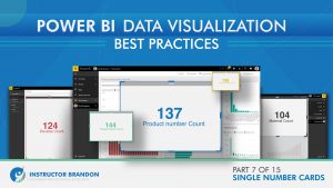
Power BI Data Visualization Best Practices Part 7 of 15: Single Number Cards
In today’s world of digital excellence, Microsoft Power BI is a tool that helps companies [...]
Jan
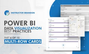
Power BI Data Visualization Best Practices Part 6 of 15: Multi-Row Cards
When it comes to understanding data to its fullest, there is an absolute need to [...]
Jan
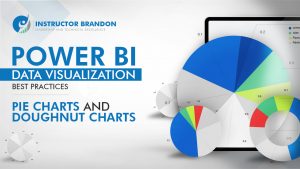
Power BI Data Visualization Best Practices Part 5 of 15: Pie Charts and Doughnut Charts
Moving on in our Power BI Data Visualization Series, it is now time to cover [...]
Dec
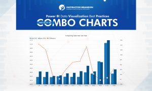
Power BI Data Visualization Best Practices Part 4 of 15: Combo Charts
The concept of Business Intelligence is not new in our world but has gained more [...]
Dec
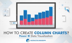
Power BI Data Visualization Best Practices Part 3 of 15: Column Charts
The world is now digitalizing. Since businesses are opting for a more ‘digital approach’ in [...]
Dec
- 1
- 2

