Microsoft Power BI Series
Power BI Data Visualization Best Practices Part 4 of 15: Combo Charts
 8070
8070 
Dec
The concept of Business Intelligence is not new in our world but has gained more strength within the business market in recent years.
Currently, companies are seeking to optimize their processes and generate better results. Power BI is one of the most powerful tools to help companies improve this department, and can be adapted globally.
This data analysis tool is capable of measuring and improving the Key Performance Indicators (KPI) of any business industry.
In a new Harvard Business Review Analytics survey, 87% of respondents said they believe that ‘analytical competition’ is a competitive differentiator in their industry.
The survey further stated that using Power BI and Azure Analytics together provided valuable data to companies.
Also delivering a 271% Return on Investment in less than three years.
In business intelligence, you are often asked to visualize two measures with different scales; such as income and age.
A combo chart, therefore, is useful in such cases because it visualizes multiple variables using a line and bar chart with different axes.
This guide will help you with a step-by-step approach to creating a Combo Chart in Microsoft Power BI.
Points to Consider in Combo Charts
|
Microsoft Power BI Service
“Power BI is a collection of software services, applications, and connectors that work together to help you create and consume business information in ways that help your business most effectively.”
The Microsoft Power BI service is the SaaS (software as a service) part of Power BI. Power BI Service dashboards help you take charge of your business by showing icons to open reports and explore.
Dashboards and reports are connected to data sets in order to gather all required data in one place.
The main components of Power BI are the Windows Power BI Desktop application, Power BI Mobile applications for Windows, iOS, and Android devices.
The implementation of these three elements in your company will be beneficial to you in terms of creating, sharing, and consuming business information.
What is a Combo Chart?
Combo charts are suitable for comparing two sets of measurement values that are difficult to compare otherwise (due to differences in scales).
Put simply: it is a bar graph combined with a line graph.
An example would be a bar chart with sales figures that you want to combine with margin values (such as a percentage).
The sales bars would be shown in a normal bar chart, but the margin values would be almost invisible because of the visible difference between numerical sales values and margins.
With combo charts, you can combine these values (using the bars for sales values and a line for margin values).
By default, the bars have the measurement axis on the left and the margin values have an independent axis on the right.
Both measurements use the same dimension (Year-Month, for example).
If you already have another measure (e.g. gross sales) with values that are barely in the same range as the sales values, you can add the third measure as bars, and group the new measure values with the sales values.
Features of Combo Charts
|
When Should Combo Charts Be Used?
Due to the ease and possibility of using different scales [one on each side/left and right for measurements], the combo charts are a perfect option to show values that are otherwise difficult to combine [due to the difference in ranges].
A combo chart, however, can be handy for comparing values from the same value range.
In short, a combination chart is an excellent option:
- When you have a line graph and a column graph with the same X-axis.
- For compare several measurements with different ranges of values.
- To illustrate the correlation between two measurements in one display.
- Check if a measurement meets the objective defined by another measurement.

Combo Charts in Power BI:
Now, let’s start with an easy-to-follow tutorial to learn how to create combo charts in Power BI.
For the following step-by-step, you can use this file to find sales data and profit margins in a fiscal year. These are good examples to build this graph.
Step 1: Find the Menu Bar
First, find the Menu Bar in the upper left section and select File and Open.
Step 2: Open in Report View
Then, find your copy of the sample file and open it in report view (The button with the picture of a bar)
Step 3: Select the Yellow Button
And finally, select the yellow button with a “plus” symbol to add a new page.
How to Create a Basic, Single-Axis Combo Chart in Power BI
Learn how to create a simple combo chart in power BI step-by-step in the following manner:
Step 1: Create the column chart
Start on a blank report page and create a column chart that displays the year’s sales and gross margins by month.
- To do that, you must select in the Fields Panel the option Sales – This Year Sales – and Value
- Drag Sales – Gross Margin This Year to the Value well
- Finally, select Time – Fiscal Month to add it to the Axis well
You should have something like this on your Dashboard now:

Step 2: Change the order of classification
Now, select more options in the upper-right corner of the visualization, and select Sort by – Fiscal Month. To change the sort order, select the ellipsis again and choose either Sort ascending or Sort descending.
For this example, we will use Sort ascending.
Step 3: Create your Combo Chart
You’re ready to convert the column chart to a combo chart!
There are two combo charts available: Line and stacked column and Line and clustered column. First, with the column chart selected [from the Visualizations panel], select the Line and clustered column chart [like in the icon below]

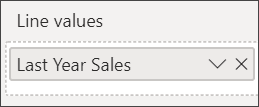
Then, from the Fields panel, drag Sales – Last Year Sales to the Line Values bucket:
Finally, your combo chart should look something like this:

How to Create a Combo Chart with Two Axes?
In this example, we’ll compare gross margin and sales.
Step 1: Choose data of ‘one year’
Create a new line chart that tracks Gross Margin last year % by Fiscal Month. Select the ellipsis to sort it by Month and Ascending. In January, GM% was 35%, peaked at 45% in April, dropped in July, and peaked again in August.

Step 2: Select the following year’s data for comparison
Add This Year Sales – Value and Last Year Sales to the line chart. The scale of Gross Margin Last Year % is less than the scale of Sales which makes it difficult to compare.

Step 3: Convert the Line Chart
To make the visual easier to read and interpret, convert the line chart to a Line and Stacked Column Chart.
It is the highlighted icon in Visualizations Panel.

Step 4: Create the two axes
Drag Gross Margin Last Year % from Column Values into Line Values. Power BI creates two axes.
This, in turn, allows datasets to be scaled differently.
The left measures sales dollars and the right measures percentage; and we can see a similar pattern.

And that’s it!
Now you have your combo chart. To finalize, we have to add a title to the axes.
How to add Titles to the Axes in Power BI?
Step 1: Select the axis
First, you have to select the paint roller icon to open the Formatting panel.
Then, select the down arrow to expand the Y-axis options.
For Y-Axis (Column), set Position to Left, set Title to On, Style to Show title only, and Display units as Millions.

Step 2: Scroll down
Under Y-Axis (Column), scroll down until you see Show secondary.
Because there are so many options for the Y axes, you may have to use both scrollbars.
The Show secondary section displays options for formatting the line chart portion of the combo chart.

Step 3: Set style for the Axis
For the Y-Axis (Line), leave Position as Right, turn Title to on, and set Style to Show title only.
Your combo chart now displays dual axes, both with titles.

Step 4: Put some style in
Optionally, modify the text font, size, color and set other formatting options to improve the display and readability of the chart.
And that concludes one of the simplest procedures for creating a combo chart.
Now try it with your own data; and if you feel you need a little inspiration to create your visualizations, you can look at these amazing examples of our portfolio.
Best Practices for Combo Charts
Data visualization is an essential part of both digital analytics and executive reporting.
Choosing the most effective way to display data allows us to communicate it better; therefore, making it more actionable for the client.
On the other hand, it is also handy for the analyst since it helps him/her identify patterns, trends, and outliers that deserve better-detailed analysis.
Understand the information
For a correct visualization, it is essential to have a previous conceptualization phase that demonstrates the analyst’s good work and his understanding of the data being worked with.
Design
‘Less is more’ and ‘the beautiful is the useful’ are two good philosophical premises to apply in this discipline: Avoid the superfluous and free, which only brings “noise” to the information you want to connect with. It is important to prioritize functionality over aesthetics.
Consequently, this may involve suppressing data when it is not considered relevant.
Background
Likewise, it is advisable to use uniform and clean backgrounds that allow you to focus on the data.
These bar and line charts usually need several colors to show data.
If we use a colored background, the information visualization is hindered; so we must be very restrictive in its use.
Text
The texts of the titles, legends, and units representing the axes must be understandable and friendly.
It should appear in a discreet tone (gray, for example) to not steal the prominence of the data. It is also necessary to try to include, along with different graphics, the necessary text for the visualization to be self-explanatory.
Choice of colors
Color is an essential resource in representing data: both to group those of the same category and for its own symbolic value.
Its intensity has great expressive power also; both in ranges of the same color and in ranges of different tones.
Although we normally limit ourselves to solid colors, we must not forget the possibility of playing only with outlines or with transparencies that allow us to superimpose shapes without hiding information.
Context
Whenever possible, it is good practice to contextualize data and compare it with equivalent periods.
To do this, mixing in the same bar graph to represent current data and lines for the reference period (e.g., one year ago) is a widely used resource.
But beware of this: if the variation between the reference period and the current one is large, there is a danger that one of the two elements will be minimized.

Advantages and Disadvantages of Combo Charts in Power BI
We continue with some pros and cons that we must take into account before deciding to use this type of visualization:
Advantages of Combo Charts
The combined graph is the best option when we want to combine several measurements from different value ranges.
Disadvantages of Combo Charts
The combined graphic only supports one dimension. Therefore, it cannot be used when it is necessary to include two or more dimensions in the display.
Take Away
Combo Charts are used in all industries because of their power to represent multivariate information.
Another advantage of combination charts, such as bar charts with lines, is that you can use them to visualize measures that belong to different scales, such as revenue in dollars and units sold. You can use the line graph-bar chart in manufacturing, utilities, e-commerce, retail, and almost every other industry.
CONCLUSION:
In this article, we explained a simple process for creating a combo chart that helps you perform multivariate analysis; at the same time strengthening your descriptive analysis skills.
Thank you for reading part 4 of our Power BI Series. If you want to learn more about us and our Microsoft Dynamics 365 courses, please don’t hesitate to contact us. – Brandon Ahmad, founder of Instructor Brandon and Dynatuners.
As always, don’t forget to leave us a comment in the section below!

