Microsoft Power BI Series
Microsoft Power BI Data Visualization Best Practices Part 12 of 15: Slicers and Tables
 5642
5642 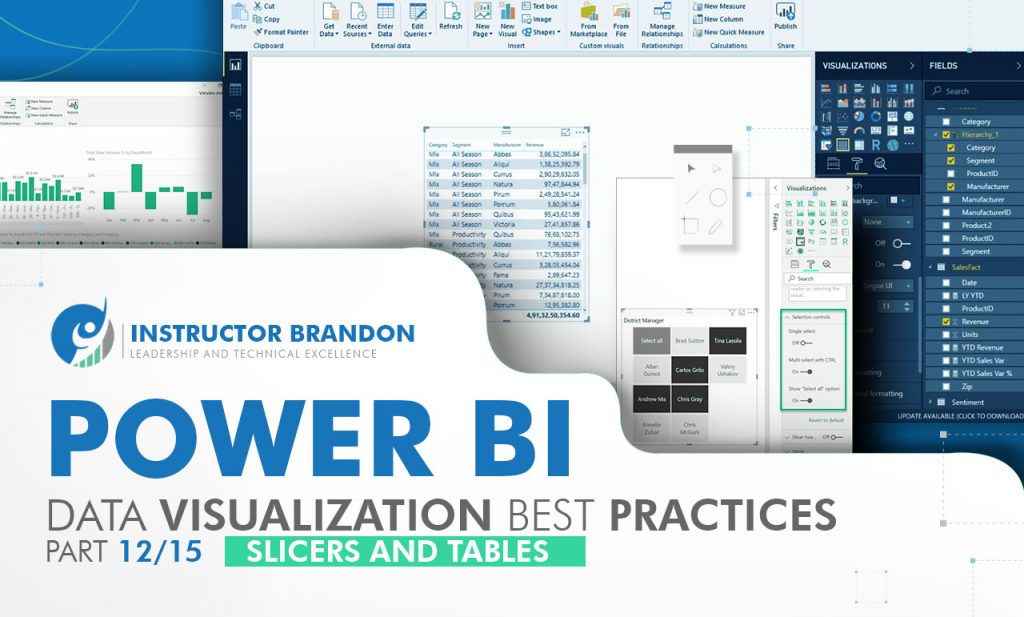
Jan
Microsoft Power BI, by far, is one of the best pieces of digital technology applied to business intelligence analytic services in the past few decades, and some of its features, like Slicers and Tables, are the reason for this.
For companies living in the ‘new’ world, a world where SaaS technologies are here to stay, globalization is important and this is where Power BI comes in. Standing out in today’s highly competitive business world has become important for your company, which is why it is even more crucial to make well-informed business decisions.
Having relevant information extracted from organic data, and the skillset to present it in an easy-to-understand, lucid way is a competitive advantage.
Remember: data is only data if useful; which is why Power BI insights are the key to simplified action for decision-makers within your company. For this reason, Microsoft Power BI Suite is quite relevant for your company: being able to turn all sorts of business data into useful information.
Without a doubt, Microsoft Power BI is clearly a set of tools that play a key role in business strategy and business intelligence.
Ideas to Consider in Microsoft Power BI Training Part 12: Best Practices for Using Slicers and Tables
In this post, we will address:
- Why is Business Intelligence so important for companies?
- Why is Power BI important?
- What do Power BI Slicers do?
- How to use Power BI Slicers?
- What do Power BI Tables do?
- How to use Power BI Tables?
- Takeaways for Microsoft Power BI Slicers and Tables
Why is Business Intelligence so important for companies?
Business Intelligence helps in executing clear monitoring of a business’ raw data through various processes and techniques. The main, and possibly the most important feature of Power BI is the accessibility of large volumes of data from multiple sources. Firstly, it enables the user to view and analyze large data volumes from multiple Power BI Data Sources such as CSV, XML, JSON, and PDF; something that is not accessible through Excel alone. Secondly, you can use characteristic functionalities of the tool that allow you to copy the entire format in similar visualizations through a simple drag.
Microsoft Power BI, consequently, has exceptional integration with Excel (built-in) that makes it easy to collect, study in-depth, shape, and display business data from Excel in a simple way. Additionally, it benefits big data development acceleration with Azure; using Power BI with Azure enables you to examine and distribute large data volumes. Moreover, Power Bi with Azure Data Lake can increase collaboration between data scientists, data engineers, and business analysts: allowing them to get insights faster and turning them into real data-driven business decisions.
Last but not the least, it allows you to enter multiple sensors in social media sources to obtain real-time data through flow analysis, making sure you are always ready. Across all industries, large organizations have already figured out how to use their data to its fullest potential. For this reason, the need to understand different types of business intelligence tools available in the market is crucial.
Why is Power BI important?
Just as people advance and move towards a more technology-oriented work culture, modern tools in companies (based on the cloud) are now being adapted to the workplace environment.
This technologically-advanced era has given rise to a boost in commercial actions by optimizing operations and internal processes.
Adopting modern cloud resource management tools and techniques can also increase your own company’s productivity, impact, and influence in the industry. As a result, many businesses have discovered how they can improve response time to customers, or even the accuracy of their forecasts; while saving countless hours of work and associated costs.
How does Power BI Work?
What is Power BI?
To start off with, Power BI is one of the most influential digital instruments in the realm of businesses; for many reasons.
First, Microsoft Power BI is essentially the “best of the best”, as it is a perfect mix of the best BI products in the industry, such as Microsoft Excel and SQL Server Analysis Services. Secondly, is regularly renewing with the newest technologies like cloud computing, column store databases, smartphone mobile apps, and HTML 5.0. For instance, Microsoft Power BI allows you to visualize your data and share knowledge with the rest of the company to work better. As a cloud-based business analytics software service (SaaS), Power BI provides a new skill to non-technical business users; helping them to build different graphs and charts to visualize data.
For a better understanding, we can look at some of its features:
- Power BI Desktop allows you to build reports by accessing data easily, so you do not need advanced report designing or query skills to build a report
- Supports stream analytics (from factory sensors to social media sources) and assists in real-time analytics to make timely decisions
- Can access various sources of data such as Excel, CSV, SQL Server, Web files, etc.
- Custom visualization
Power BI Components
There are six major components of Power BI:

When it comes to making reports more dynamic and alive, Power BI Slicers are one of the most important visualization types. The report filters in any visualization only work on the table where they are set, and no more. It is not possible to use them to filter data in graphs or tables next to them. However, with Slicers, we can connect several graphs and tables just using the mouse. A Slicer is an on-canvas visual filter in Power BI Desktop that is easy to understand; by looking at a report segment with a particular value, such as by year or by region. Most companies have already used or seen Slicers in Excel. With the help of Power BI Slicers, however, our companies have reached a new high by filtering all types of elements between interconnected tables and graphics.
But why use a Slicer?
A Slicer can be used when you desire to take benefit of a visual level filter where your preferences will shift with the core of the slicer, depending on the task.
Where are Slicers used?
Slicers are used depending on where your company’s specialization lies. For instance, Slicers can exhibit currently-filtered data without opening a drop-down menu or a filter. As a result, they can facilitate access by displaying significant or commonly-used filters on the canvas. Organizations put Slicers next to their relevant visuals to create reports more creatively, and to filter columns to exclude irrelevant or reserved tables’ data.
How to use Power BI Slicers?
In the entirety of this series, as well as in our upcoming preparatory courses on this topic, we will delve into all the processes in-depth and in detail. However, we can give a small example of what this tool looks like within the Power BI Desktop.
Step-by-step on how to call Slicers on Power BI Desktop:
| 1. First, to call a Slicer make sure you are not inside another board and activate with a click on the blank area. Otherwise, it will be creating a Slicer on another existing board deleting all its information. |  |
 |
2. To add the Slicer to your report, select it from the visualizations panel. |
| 3. The Slicer menu will be placed in the blank area. |  |
 |
4. Select the features on fields to insert. Then drag to field and drop. |
| 5. The pre-selected field data will appear. The visualization turns into a list of elements with checkboxes. |  |
What can Power BI Tables do for you?
Every time you create a colorful display, it will not necessarily be enough for you to make a proper business decision.
Sometimes, we will see ourselves in scenarios where we must make visuals in tabular format to be able to see the information directly and make an appropriate commercial decision; for this, we create the tables in Power BI.
Without a doubt, this is one of the best ways to organize data in an efficient and orderly manner by any type of user. It is also useful for the individual for measuring information within their data model in Power BI Desktop.
Technically, a Table is a grid filled with data interconnected in a rational series of columns and rows. Besides this, it can also contain some headers and a row for the totals. As a side note, tables work very well for tasks where you need to make quantitative comparisons and at the same time have to look for many values in a single category.
Where are Power BI Tables used?
As we mentioned, it is very beneficial to create Tables within reports and highlight items within the table; with other visual elements on the same report page. You can copy and paste individual cells and multiple cell selections into other applications. Additionally, you can also select columns, rows and highlight individual cells.
Firstly, Tables are the best fit to show data and statistics by categories.
Secondly, they are also a good fit for viewing and contrasting specific data and precise values. Last but not the least; they are also beneficial in presenting data in a tabular setup.
Remember:
As a characteristic, Tables can collect all measures or any variety of them. You can have multiple measure tables depending on how you set this up.
However, why exactly would you want to use a Table?
It is a consolidated place; a centralized space where, if you’re building a report or delivering a data model to someone who is, the only thing they need to do is to go to that ‘centralized space’ and look for all the measures.
How to use Power BI Tables?
Let’s take a look at an example of what this tool looks like within the Power BI Desktop.
Step-by-step on how to call Tables on Power BI Desktop:
| 1. First, call a Table, but make sure you are not inside another board and activate with a click in the blank area. Otherwise, it will be creating a Table on another existing board deleting all its information. |  |
 |
|
| 3. The Table menu will be placed in the blank area. |  |
 |
4. Select the features in fields to insert; then drag to Values and drop. |
| 5. The pre-selected field data will appear, and the visualization turns into a list of elements with checkboxes. |  |
It’s clear why Power BI stands out when compared to other BI tools.Business intelligence insights need not be scary; there are a variety of resources like Power BI Slicers and Tables to educate and empower both individuals and businesses. Therefore, it is crucial to understand the need to properly handle the different types of business intelligence tools available today. These tools are great to explore and experiment with. The more knowledge users and companies have the more complete and powerful their potential will be. Microsoft Power BI has a free version available different from its Tableau Desktop counterpart, and although QlikView has it available, it does not have Predictive Analytics or Semantic Querying / Natural Language. Today’s business leaders, in every industry, have discovered how to use their data to its fullest potential.
Thank you for reading part 12 of our Microsoft Power BI Series If you have any questions, you can leave us a comment in the section below and we will get back to you as soon as possible. Additionally, make sure to stay tuned for our next blog post, where we will talk about best practices for Using Maps.
Takeaways about Microsoft Power BI Slicers and Tables
First, a quick summary of all the concepts saw so far:
[sc_fs_multi_faq headline-0=”h2″ question-0=”What are Slicers in Power BI?” answer-0=”Is one of the most important visualization types when it comes to making reports more dynamic and alive. In the entirety of this blog post, as well as through our Power BI Series, we will delve into all the processes in-depth and in detail.” image-0=”” headline-1=”h2″ question-1=”What is the difference between Slicer and Filter in Power BI?” answer-1=”The main difference between them is that the Slicer is, as mentioned before, a dynamic visualization working on-canvas, instead, a filter is itself a static feature working in the background. We are giving more detailed information in this blog post.” image-1=”” headline-2=”h2″ question-2=”Can you add Slicers to a regular Table?” answer-2=”The short answer is yes, you can. Just click in a table, then go on the home tab, go to insert > slicer, then in the insert slicers box select the checkboxes for the fields you want to work with, then select OK. Continue reading this blog post to get more detailed information and go to the next level.” image-2=”” headline-3=”h2″ question-3=”Are Filters and Slicers the Same?” answer-3=”No, slicers are basically dynamics visualization features on-canvas, instead, filters are static heading features that work in the background. This is treated in more detail through this blog post and our Power BI Series.” image-3=”” headline-4=”h2″ question-4=”How do I make my Slicers look good on Power BI?” answer-4=”You can put Slicers next to relevant visuals to craft creative reports and to filter columns to exclude irrelevant tables’ data. Also, you can exhibit currently-filtered data without opening a drop-down menu or a filter. As a result, they can facilitate access by displaying significant or commonly-used filters on the canvas. These and more tips are displayed through this blog.” image-4=”” count=”5″ html=”true” css_class=””]
