Microsoft Power BI Series
Power BI Data Visualization Best Practices Part 10 of 15: Dashboards
 7070
7070 
Jan
When it comes to managing your business, the data you obtain from your daily operations plays a key role in driving your every decision. However, when many reports contain large quantities of unfiltered data, it can be hard to interpret the information in a way that proves beneficial to your company. Just think about it: how many times have you found yourself wishing for an easier, better way to digest your company’s data? Considering how difficult it is to go through reports containing raw numbers and even understand them, we are sure you think of that frequently.
Fortunately, there are more ways of getting an overview of your company’s performance than sorting endless sheets of boring, time-consuming reports. We now have access to high-quality business intelligence tools that facilitate that process.Welcome back to our Power BI Series. In this blog post, you will learn the basics you need to know to successfully visualize your business data using Microsoft Power BI Dashboards.
Before we dive into the benefits of Power BI Dashboards, though, we need to elaborate on a very important concept.
What is Business Intelligence (BI)?
You see, to understand Microsoft Power BI and the usefulness of Power BI Dashboards, you first have to understand the concept of business intelligence. Business intelligence (BI) is the set of tools companies use to compile, organize, and interpret their data to make better decisions quickly and accurately. Out of these tools, those that see the most use are the software programs that facilitate data visualization like Microsoft Power BI. These programs process large amounts of data, giving relevant information to those that need it right when they need it.They also prevent information breakups by allowing you to integrate diverse data sources. Thanks to that, companies can avoid making key decisions without having all the information they need.
Now that you know what business intelligence is, let’s talk about Microsoft Power BI.
What is Microsoft Power BI?
Power BI is one of Microsoft’s business intelligence tools. It allows you to analyze the data stemming from your business processes and compile all the key information in a single, easy-to-understand Dashboard. In other words, Power BI helps you keep track of all the key performance indicators (KPIs) of your company, showing you up-to-date metrics that you and others can access from any device. With this one-of-a-kind data and analytics reporting tool, you can turn what used to be lengthy, time-draining sets of data into interactive, scalable, and compelling reports. With that in mind, let us dive into the advantages and disadvantages of Microsoft Power BI.
Advantages and Disadvantages of Microsoft Power BI
Although Microsoft Power BI offers many advantages to companies seeking to optimize their processes, it also comes with a few disadvantages:
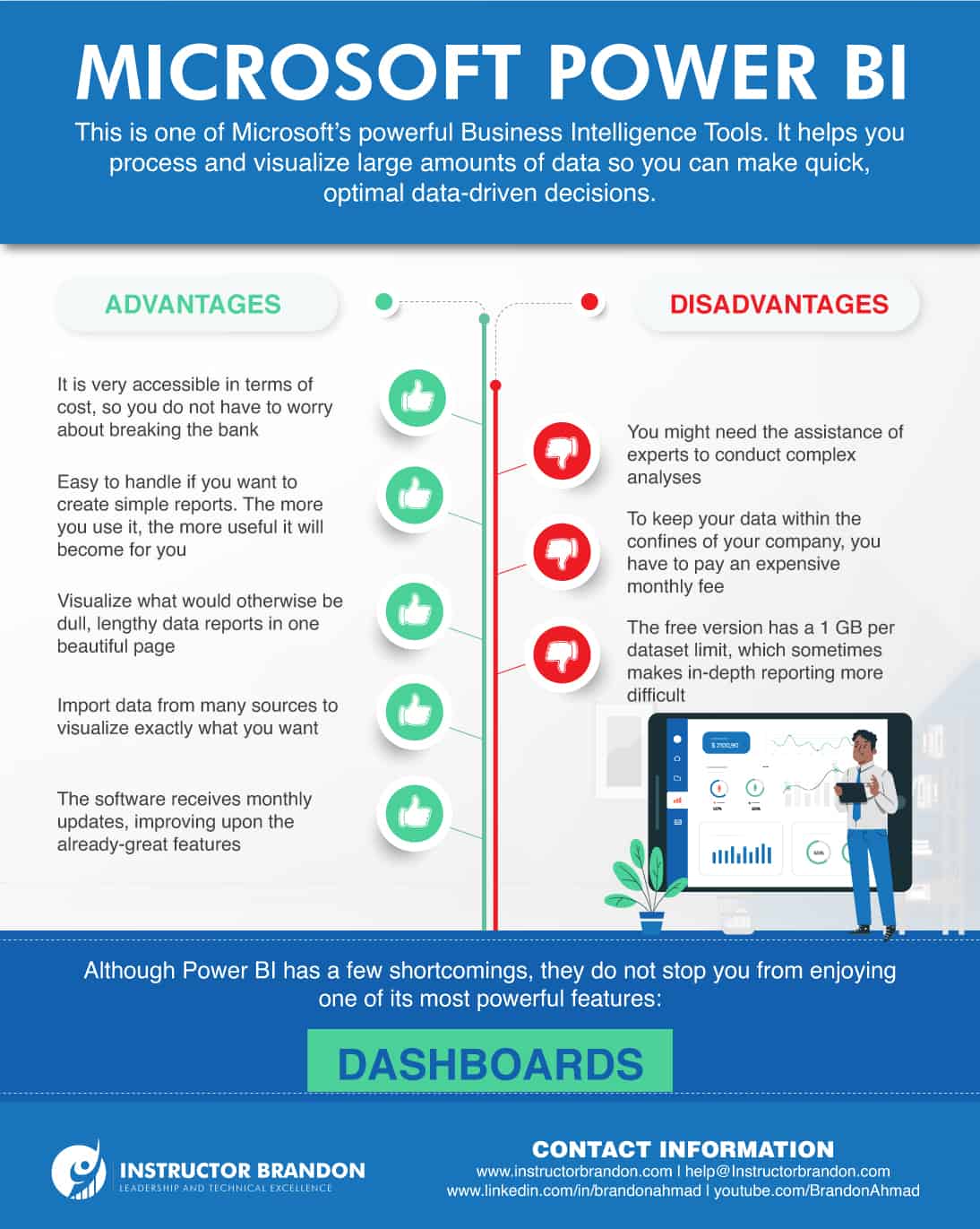
Advantages of Power BI
- It is affordable
- Easy, yet rewarding learning curve
- Outstanding visualization capabilities
- Microsoft updates it constantly
- Power BI digests data from many sources
1. It is affordable
First, you cannot talk about the advantages of Power BI without mentioning how inexpensive it is to use. It is even free if you just want to build reports for yourself. Even though it can be a little tedious, you can still share data using the free version of Power BI. All you have to do is give the Power BI files containing your created datasets, Dashboards, and reports to someone else. However, that means each person would have their own version of your data, so they would need to maintain it independently. If you want to avoid that, Microsoft offers cloud hosting at the cost of a small fee for each user.
2. Easy, yet rewarding learning curve
Second, Power BI is both intuitive and easy to use. After you import your data to Power BI, using it to make graphs, charts, and tables to visualize that data is not that complex. Things can get a little complicated when you start incorporating additional tools like Power Pivot and Power Query, but if your goal is to make simple reports to measure a set of metrics, you will be fine.
3. Outstanding visualization capabilities
The third on the list of advantages is the software’s visualization capabilities. Microsoft Power BI can tell meaningful data stories by importing data from diverse external and internal data sources. Additionally, the possibility of creating personalized Dashboards makes it so business users of any level can use Power BI to make swift data-driven decisions. If you want to see a few samples of how personalized Dashboards may look, check out our portfolio of inspiring Dashboards for Dynamics 365.
4. Microsoft updates it constantly
The fourth advantage is that Power BI receives continuous support from Microsoft. Every month, they add new updates to the software. In these updates, Microsoft adds new features and addresses the concerns of the user community. You can keep track of the updates and the changes that come with them by following the Power BI Blog.
5. Power BI digests data from many sources
The fifth and final advantage of Power BI is its ability to read many types of data. You can import data from Microsoft Excel, the cloud, Google Analytics, Facebook, and text files like XML and JSON. Its ability to read hundreds of data sources proves useful while creating Dashboards. After all, data is not always stored in the same place, so the fact that you can combine different types of data no matter where they come from is fantastic. Although Power BI has many superb qualities, it also has its shortcomings. Here are a few of them.
Disadvantages of Power BI
- Data limitations
- Costly on-premises hosting
- Advanced analytics are complex
1. Data limitations
Power BI allows you to store copious amounts of data, but there is still a 1 GB limit per dataset that is imported into Power BI. Despite that, there are two ways to get past these data limitations. One is creating multiple queries to process the dataset, and the other is upgrading to Power BI Premium to import datasets of up to 12 GB in size.
2. Costly on-premises hosting
While it is true cloud hosting is affordable, on-premises storage and processing are very expensive. Even then, it is still a useful option for companies facing specific legal regulations that demand they keep their data and reports to themselves.
3. Advanced analytics are complex
As we mentioned in the list of advantages, Power BI is easy to use when you want to create simple reports. However, you need to be well-versed in different tools to conduct complex analyses. Overall, the advantages outweigh the disadvantages. Although the latter can pose many challenges, you can bypass them with experience and help from experts. Luckily, it does not take in-depth understanding to use one of Power BI’s greatest features, Dashboards.
What are Power BI Dashboards and What are Their Benefits?
A Power BI Dashboard is a single page filled with tiles that tells the complete story of your business through visualizations. Due to its one-page limitation, it only contains the most important elements of the story. Moreover, the visualizations on each tile come from Power BI reports based on previously-analyzed datasets. Yet, that does not stop them from updating as time passes. Every time a new dataset appears locally or in the cloud, it influences the previous reports, changing what is shown in the Dashboard. That consolidated view of your business data offers you a unique opportunity to measure your KPIs at a simple glance, allowing you to immediately spot what needs to be changed to meet or surpass these important metrics.
But it does not stop there, Power BI Dashboards also come with other benefits:
- You can share them instantly, giving your team a unified view of how the company is performing
- Viewing Dashboards is possible across multiple platforms and devices, so you can keep tabs on your metrics at all times
- Easy-to-use functionalities like drag-and-drop
- An ever-growing online community that offers support and ideas on building Dashboards
Yet, the most remarkable benefit that we will never get tired of repeating is that it allows you to intuitively visualize data. Speaking of data, we are sure you are wondering about the kind of data you can import into Power BI to create a Dashboard. Keep reading to find out.
What Kind of Data Can You Use to Create Dashboards?
Datasets are the core of Dashboards. On top of being able to import datasets from the cloud or on-premise databases, you can import the following data source types into Power BI to create Dashboards:
- Excel files (.xlsx, .xlsm)
- Comma-separated value (.csv) files
- Power BI Desktop files (.pbix)
- Other file types like XML Table (.xml) or text (.txt)
While the first three are pretty straight forward, the fourth allows you to use many different data sets for your Dashboard. For example, let’s say you are trying to use data from Microsoft Dynamics 365 CRM to create a Dashboard. To do so, you would first have to convert the data into XML format.
Although there are different ways to do that, like converting entity collections into XML via X++ coding or Electronic Reporting, the process would not stop there.You would also need to use the Get & Transform feature of Power Query to query, transform, and load that XML data into an Excel or Power BI Desktop file. After that, you will be able to import the Excel or Power BI Desktop file into Power BI to create your Dashboard.
Judging by the looks, it seems like a lengthy, complicated process, right?
Thankfully, there are easier ways to configure Power BI to integrate it with Dynamics 365. To learn more, check out Module 3 of our MB-300 course, where we detail the ins and outs of how to import data from Microsoft Dynamics 365 into Power BI.
How do I Create a Dashboard in Power BI?
The fact that you can import many types of data to Power BI is great, but it is meaningless if you do not know what to do with it. For that reason, here is a basic guide to help you get started with the creation of Dashboards.
Step-by-step beginner’s guide to creating Dashboards
| 1. Type app.powerbi.com in your browser to open the Power BI service. | 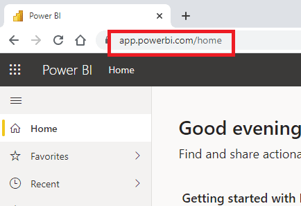 |
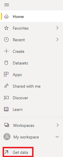 |
After signing in, click Get Data on your workspace to import a report. If you do not have any reports available right now, you can use this sample Excel fileprovided by Microsoft. |
| 3. Once you do, you will see four options. Since we are doing things the simple way this time around, go to Files under the Create New Content segment and click Get. | 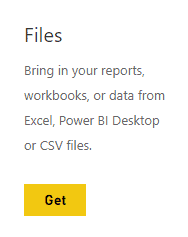 |
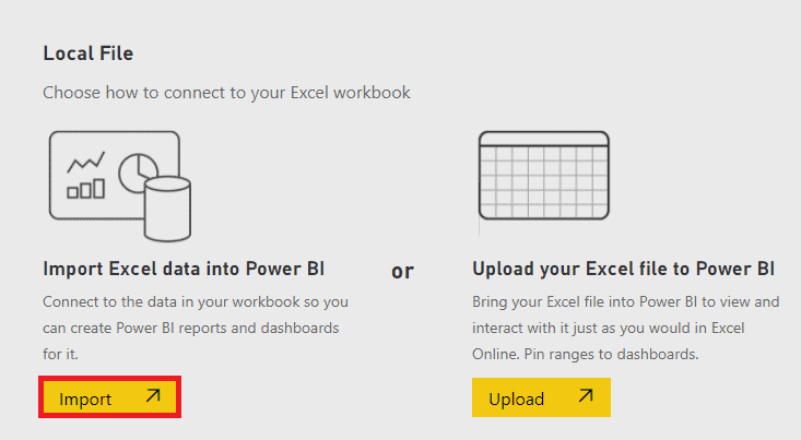 |
4. Locate the file you want to upload and select it. After that, you will see two options. Click Import under the Import Excel data into Power BI option. Shortly after, a message will pop up telling you your dataset is ready. Click X to dismiss it. |
| 5. Next, open the Report you want to work on by clicking on it. | 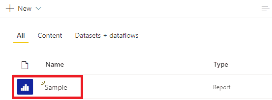 |
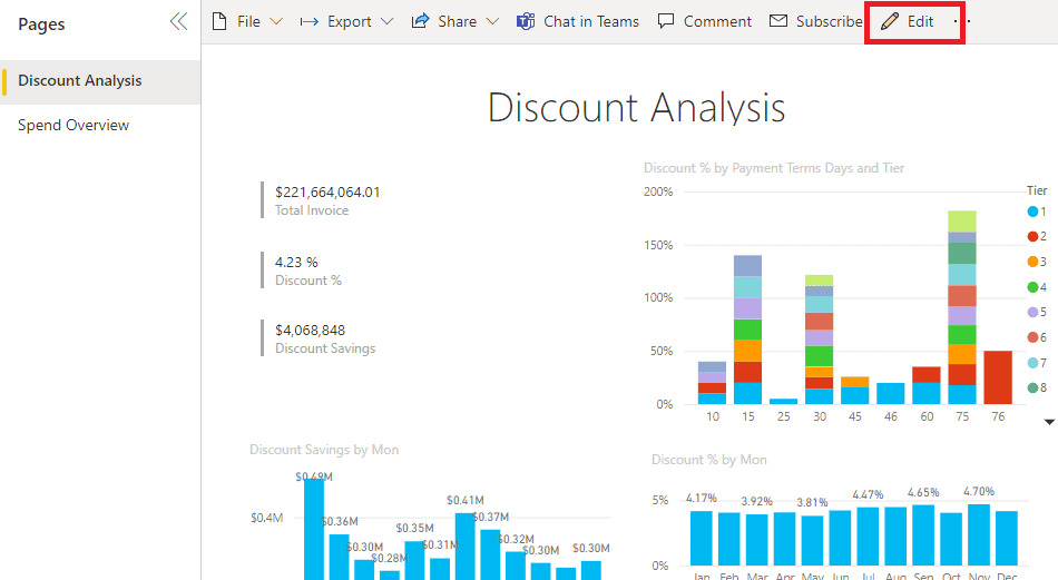 |
6. As you might have noticed, the Report opens in Reading view. You can also see there are two tabs representing each page of the report on the left. If you want to enter the Editing view, click Edit. |
| 7. Now you can hover over each visualization to reveal the available options. Moreover, you can add a visualization to a Dashboard by selecting the Pin icon. | 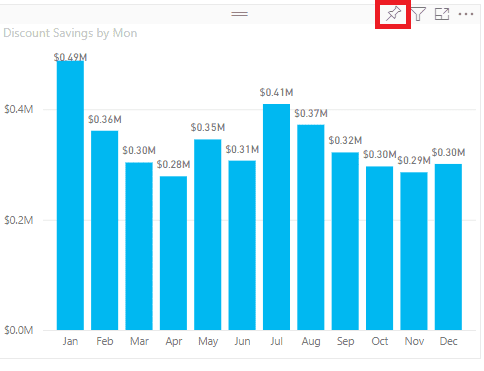 |
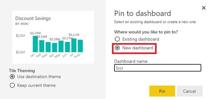 |
8. Once you choose the visualization you want to Pin, a window will pop up asking you to select a Dashboard. Since we are creating a New Dashboard, choose that option. |
| 9. When you open the new Dashboard, you will see the visualization you just pinned. To return to the report to Pin more visualizations, you can simply click on the Tile. Do not forget to choose the Existing Dashboard option to add more visualizations to your current Dashboard, though. | 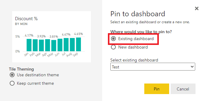 |
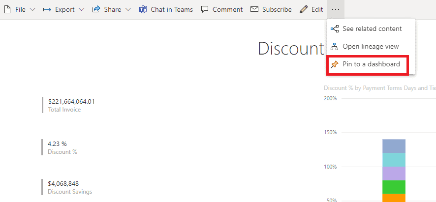
Now you have done all it takes to create a Dashboard from a report. You can also Pin an entire report page to a Dashboard with a couple of clicks. To do that, just click More options (…) and select Pin to a dashboard.
Microsoft Power BI Dashboard Design Considerations
Now that you know how to create a Dashboard, there are a few things you should take into account to ensure you are getting the best out of them:
-
Make sure to only include key data: The main purpose of Dashboards is to present information while avoiding all the unnecessary, hard-to-understand fluff. Keep things simple with a clean design. People seeing your dashboard will thank you, trust us.
-
Think of what visualizations best represent your data: Microsoft Power BI offers many options to bring life to your data, but they are not a one-size-fits-all sort of deal.
-
Use a consistent color scheme: Just because it is data visualization, it does not mean it cannot be pretty. If you use it correctly, color can make your data stand out and shine.
If you keep these things in mind, every Dashboard you create will be successful in communicating what you want.
CONCLUSION: MICROSOFT POWER BI DASHBOARDS
No doubt, Microsoft Power BI Dashboards are one of the best ways in which you can represent data. Not only does it put all the important information in one place with ease, it also portrays it in a way that is both appealing and easy to consume. Moreover, Dashboards help you turn your raw data into actionable business intelligence, which is highly profitable long term. Now, what are you waiting for? Start using Power BI to create Dashboards today.
Thank you for reading part 10 of our Power BI Series; do not forget to leave us a comment in the section below if you have any questions, we will get back to you as soon as possible. Additionally, make sure to stay tuned for our next blog post where we will talk about Key Influence Charts.
Furthermore, if you want to learn how to leverage your business data using Power BI, you can reach out to us here. This has been Brandon Ahmad, founder of Instructor Brandon and Dynatuners.

