Microsoft Power BI Series
Power BI Data Visualization Best Practices Part 3 of 15: Column Charts
 16593
16593 
Dec
The world is now digitalizing.
Since businesses are opting for a more ‘digital approach’ in recent years, organizations have now become remotely accessible through the use of simple online tools and technology.
Using the digital medium as a stepping stone, Microsoft Power BI (Business Intelligence) and real-time data export have become crucial for all business activity; with the main attraction being ‘the creation of visuals to show data in a way that connects.’
Following up on our Power BI Blog Series 1 – 15, we choose to talk about Column Charts in Power BI today; their importance, and a number of pros and cons that you should be on the lookout for.
“In short, you will learn how to share your company’s data in real time.”
Perhaps one of the most important features of Microsoft Power BI is the different visualizations to show data and analyze them in real time; Column Charts being one of them.
These charts are a quicker and effective way to visually represent data, therefore; once you learn to create these charts you will be improving your organizational processes.
Let’s get started!
Power BI Column Charts
What is a ‘Column Chart’ in Power BI?
Deemed one of the most important, a Column Chart is used to represent categorical data in rectangular bars; with the length of the rectangle denoting a specifically measured value.
The category with the highest measure value has the longest bar, whereas the one with the lowest value has the shortest bar.
This chart is helpful in representing categories, as it visualizes only one dimension with a measure.
The height of each bar is proportional to a specific aggregation (the sum of the values of the category it represents).
Categories could range from age groups to geographic locations.
How does a Column Chart work?
A Column Chart is a way to summarize data set by category. It shows data using several bars of the same width; each representing a particular category.
“If applied when creating an analysis, the Column Chart can show additional information on reference lines or several different types of curves.”
These curves could show whether the data points fit a particular polynomial curve well or not. They are also able to summarize a set of sample data points by fitting them to a model that describes the data with a curve/straight line in the display.
The curve normally changes its appearance depending on the values that have been filtered out of the analysis. When the mouse is hovering, a tooltip will show how the curve is calculated.
SUMMARY: Column Charts Power BI
- The Column Chart is used to represent categorical data in rectangular bars by the length of the rectangle denoted by a specific measure value.
- It can show additional information on reference lines or several different types of curves.
- This chart is the most commonly used one, globally.
The Composition of a Column Chart:
It is composed of two axes:
- Abscissa axis or horizontal axis, represented by the letter X
- Ordinate axis or vertical axis, represented by the letter Y
In the abscissa axis, values of the variable are placed.
A variable is a characteristic or quality of an individual or element that can acquire different values that can be measured. These can, therefore, be qualitative or quantitative.
On the ordinate axis, bars proportional to the frequency of data are placed.
Frequency is the number of times the variable is repeated during an experiment or statistical sample.
Placing the variable in the abscissa axis and the frequency in the ordinate axis, we will obtain a Vertical Bar Chart. If (instead) we invert it, placing the variable in the ordinate axis and the frequency in the abscissa axis, we will have a Horizontal Bar Chart.
The 3 Types of Column Charts:
Below are the 3 different types of Column Charts that are crucial in Power BI:
| Type | Description | |
|---|---|---|

|
Simple Column Chart |
It represents the data of a single series or dataset. |

|
Grouped Column Chart |
Compares data from two or more series or datasets.
As an example, let us assume we have surveyed favorite sports in two elementary classes: the second and third. We will represent each class with a different color, placing two bars (one of each color) for each variant. |

|
Stacked Column Chart |
It also serves to represent two or more series or data sets, but the bars representing the frequencies of each variable are stacked on top of each other.
This type of graph allows for a quick, comparative view of the totals for each variable, but the comparison between the two sets (the two classes) is less clear. |


What Are the Pros and Cons of Microsoft Power BI Column Charts?
Pros of Power BI Column Charts
- Simple data representation: Bar graphs represent a collection of data that can be compared with others.
- On the other hand, you can also see the time interval, that is months, years, days, etc.
- It is the easiest and most popular method for data representation and its greater understanding.
Cons of Power BI Column Charts
- One of the disadvantages of bar charts is their simplicity. This means that although they are easy to create and understand, they are not exactly accurate. So even though companies often use it, some would prefer more detailed pie charts.
- On the other hand, the accuracy of bar charts is also at stake. Reducing the raw data to a smaller amount will not fully represent what the data actually means; and will detract from the survey’s credibility.

Steps to Create Bar and Column Charts in Power BI
To create a Bar Chart, first Drag and Drop the Sales Amount from the Fields section to the Canvas region. It automatically creates a Bar Chart.
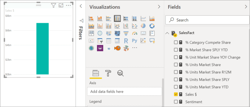
Or, start with a category field, such as Name or Product. Power BI creates a table and adds that field to the Values well.
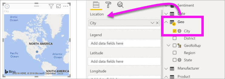
Otherwise, start with a geography field, such as Geo > City. Power BI and Bing Maps create map visualizations.
Change the Type of Visualization
You can create visualizations and then change their type.
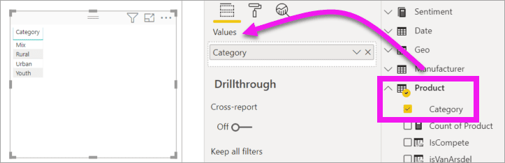
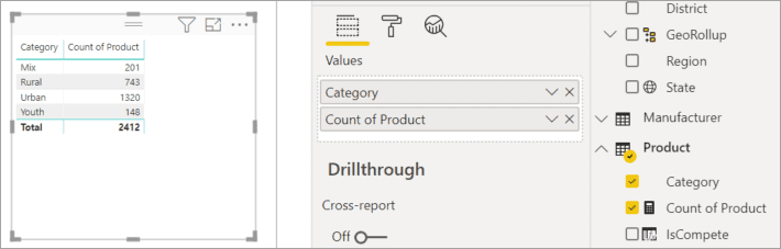
- Select Product > Category and then Product > Count of Product to add them both to the Values well.
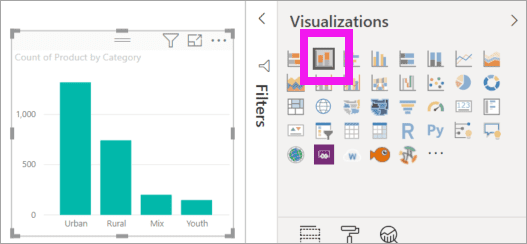
- Change the visualization to a column chart by selecting the Stacked column chart icon.
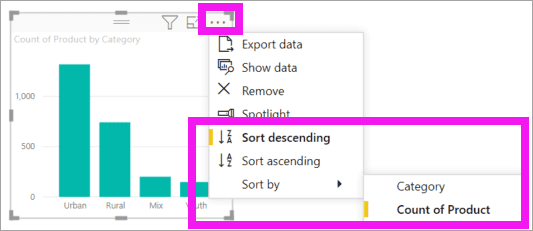
- To change the way the visual is sorted, select More actions (…). Use the sort options to change the direction of the sort (ascending or descending) and change the column being used to sort (Sort by).
Formatting
The option of formatting a bar chart is also available.
By clicking on the format bar chart option, you can format Bar Chart Title, bar colors, Data color, background colors, Axis font and colors, and much more!
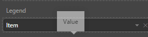
Legend
The Legend field is also a useful feature provided by Bar Charts.
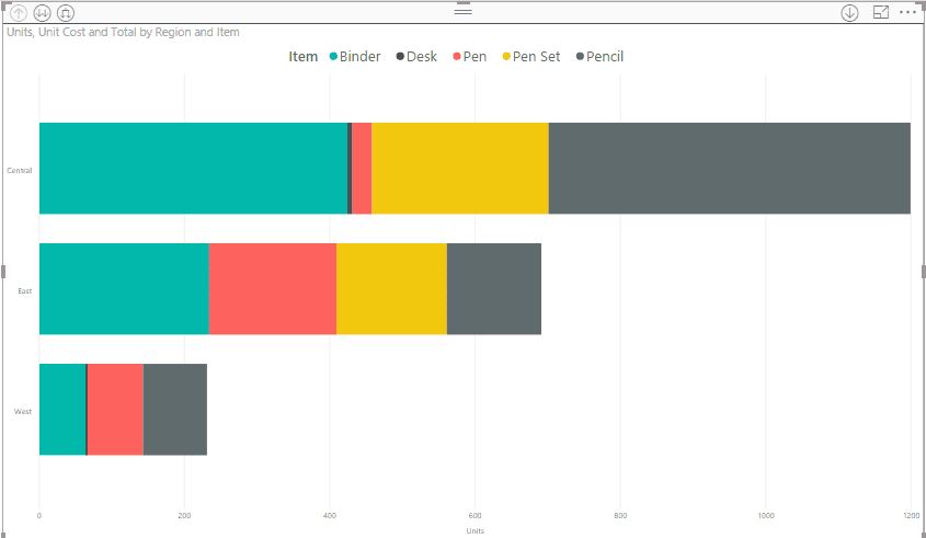
Let’s suppose we need to represent our bar in different colors with different categories
(For example, I want my first level drill down categorized with item count). So, I will select “Item” in the Category field.
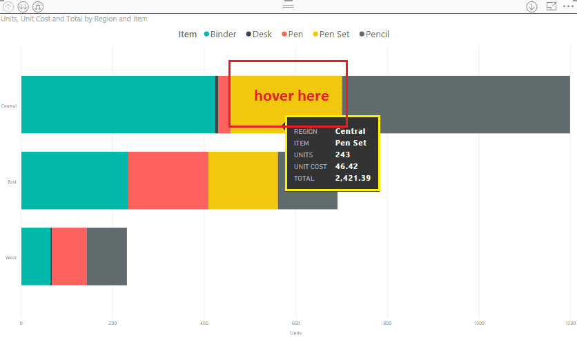
Tooltip
When you need to achieve the functionality on hover of the column chart, the tooltip is very useful.
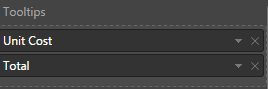
For example, on hovering over the bar chart, I want to show total and unit cost. So, I will drag both the fields in my Stacked Bar Chart.
After setting all these above properties, our chart will look like this:
Now, let’s talk about design elements
Design Elements provide the following functionality:
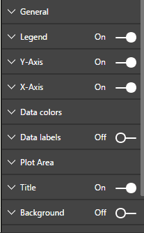
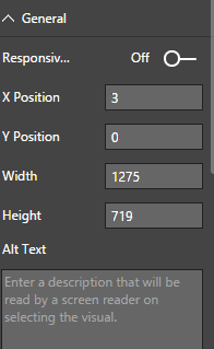
General
Here, we can set height, width, X and Y position, alternative text, etc.
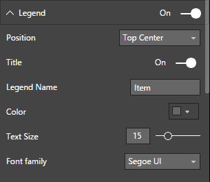
Legend
From here, you can change the legend settings, like its color, font, font size, position, and title.
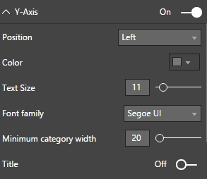
Y-axis
Through this, you can hide or show the Y-axis. Here, you can also change the position of the Y-axis to left or right.
We can also make formatting changes in this.
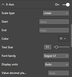
X-Axis
From here, you can hide or show the X-axis. Here, in Scale type, we have two options:
- Linear
- Scaler
In Start and End tab, we can set the figure manually if we wish. By default, Power BI automatically detects a range.
We can hide or show the title using this setting. We can also hide, show or format the Gridlines from here.
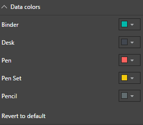
Data colors
Power BI automatically adds data colors when we are adding a visual.
If we want to change the data colors, we can do so with this option.
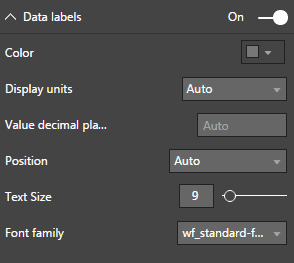
Data labels
Here, if we want to set the labels on bar, we can Switch-On this feature. If we enable the data label, it provides various formatting options.
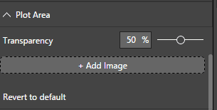
Plot Area
This setting has an option for transparency for the background. We can set the background transparency from here.
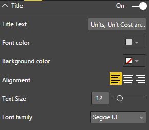
Title
Using this option, we can show or hide the Title. If we want to change or format a title, we can do that just in a few clicks.
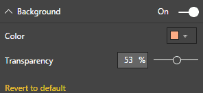
Background
Using this option, we can set the background for our visual.
It provides two options.
- Background Color
- Transparency
Lock Aspects
This feature is used to lock the proportion of the visual. If we resize the mouse, we will find our visual in the same proportion.

Border
As the name suggests, this option is used to apply border elements around Power BI visuals. We can also change the color property using this option.
What are the benefits of using Power BI?
If you still haven’t decided on Power BI as the best option to boost your business, we explain some of the benefits of using this software here:
1. Features
Microsoft has worked hard on Power BI, making sure that apps such as Power BI are rich in features with similar usability and full compatibility.
The app is designed to create intelligent visualizations based on business data, supporting you in your decision-making processes.
Power BI Pro provides the ability to create graphical data visualizations (in both independent and collaborative environments) which are then sharable between employees.
2. Embeddable Attributes
Power BI makes sure that users can embed BI and analytics with ease, enabling your staff to create interactive reports and geo-map visualization.
Through clear business environment integrations, Power BI also enables your users to produce reliable reports and analysis via dashboards, reports, and datasets.
3. Key Functionality
Drag-and-drop functionality means your staff can generate custom-made reports quickly.
The option to drill-down into data visualizations helps users to simply select and open information to gain a better understanding of what’s happening.
“Power BI’s use of natural language queries also prevents the need for users to learn a complex query language.”
4. Superior Accessibility
Power BI is empowered to run through remote apps on a variety of internet platforms and devices.
Android, iOS, and Windows devices are all runnable through Power BI, enabling you to have advanced accessibility.
Existing desktop reports can be easily adjusted to fit into these reduced landscape form factors. The apps’ user-friendliness is also enriched by its capacity to integrate with a mix of cloud software and advanced data services.
Therefore, having easy to use intuitive, graphical functions means your users require no professional training when using the app.
This ensures that your employees learn fast and adapt!
5. Connectivity
A wide range of data sources is supported, such as the sales data captured in CRM or financial data from ERP. Power Bi allows you to access On-Premise, Azure Cloud, and third-party data sources in a single, easy-to-use application.
This allows you to create new and compelling datasets from multiple disparate data sources.
And that’s not all: Power Bi connectivity is far-reaching; it includes continuously improving security measures complying with international security requirements.
6. Meaningful reports
Given the speed technology is developing at, Microsoft has chosen to heavily invest in increasing the capabilities of Power BI: long-term.
For example, the product is responsive to its market needs by operating with huge software compatibility.
“The app is powerful enough to consolidate a range of information sources into specific Datasets, so you can build reports.”
7. Updates
Continuous updates ensure that Power BI sees regular monthly updates. This is achieved through Microsoft being proactive in responding to Power BI community suggestions. New proposed functionality is voted on and implemented within the core product.
Meanwhile, as the Power BI community grows, you can be confident that your support channels will continue to grow and access more ideas for how (best) to use the app and software.
8. Refreshing data
Not all data sources support live querying.
So how do you make sure you are seeing the latest version of your data? Power BI has this covered by allowing you to refresh its data cache up to 8 times a day with Power BI Pro, and up to 48 times a day with Power BI Premium.
The simple use of Power BI’s data cache makes for simple and rapid report deployment, at the same time allowing the flexibility to see the data refreshed at set times that meet the business’ needs, all in one application.
9. Cost
Power BI has two versions; Power BI Pro and Power BI Premium. The entry-level is Power BI Pro, which gives you all functionality in Azure cloud for a low cost per user/month.
If you have a need for hundreds of users to access reports or refresh your data more than 8 times a day, then Power BI Premium is the one for you.
Power BI Premium is more expensive, but you would not need as many Power BI Pro licenses.
It further lets you get a dedicated node (compute resource) in Azure, allowing you to be more responsive to your business’ needs.
10. Rapid information breakdown
Having ease of access to understandable data quickly means your Power BI users can make increasingly informed decisions in reaction to business needs.
For example, the data presented within the app can be formatted to identify which of your markets are performing below, at, or above your expectations: creating actionable insights to make your company more competitive.

CONCLUSION: Microsoft Power BI Column Charts
One thing is for certain: technology will never stop advancing.
Learning to stay relevant in the market and keeping your business innovation-oriented is an important task today. For this reason, Power BI is currently innovating and offering the best solutions for your company and your professional growth.
I hope this part of our Power BI Series has cleared up all your doubts about Column Charts and their creation using Power BI. If you need to reach us, you can easily get in touch with us here. – Brandon Ahmad, founder of Instructor Brandon and Dynatuners.
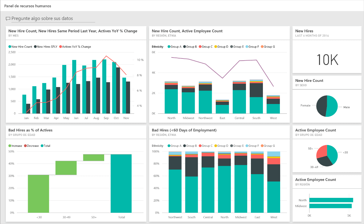
You can also visit Instructor Brandon if you want to learn more, and keep up-to-date with our latest blogs on Microsoft and Dynamics 365. Do not forget to browse our portfolio to see some examples of how to use column charts in Power BI dashboards, check out our Portfolio of Dashboards for Dynamics 365.
All our courses offer a unique and innovative experience, with the best content and hands-on lab exercises. This empowers you to learn quickly and get certified with Microsoft.
And as always, you are welcome to leave us a comment in the section below.

