Microsoft Power BI Series
Power BI Data Visualization Best Practices Part 2 of 15: Stacked Area Charts
 8397
8397 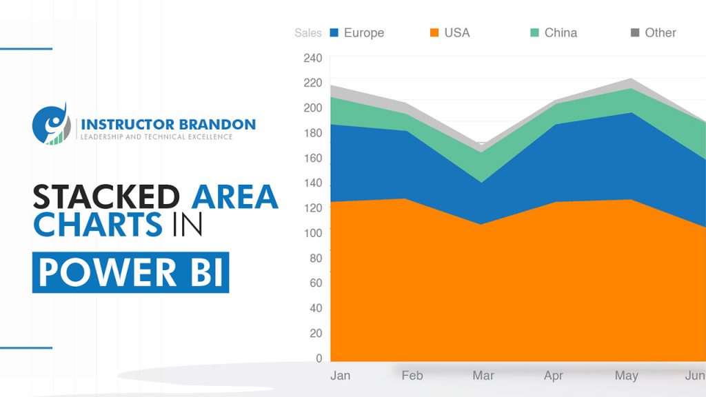
Dec
The Digital World & Business Intelligence
In the midst of a digitally competitive era, making well-informed decisions has become the main differentiating factor for businesses. Data Analysis and Business Intelligence appear to be the foundation for creating strategies for easy data access in business organizations. It is extremely useful, therefore, to count on Business Intelligence platforms such as Power BI; that help you with visualization tools (such as Charts and Bar Graphs). From Basic to Stacked Area Charts, anything is made easier with these tools if they are chosen for the right purpose.
Data Analysis
The main goal of data analysis is to organize, interpret, structure, and present ‘contextualized data’ in a useful form. Keeping this in mind, Power BI comes into action by presenting information visually that is easily understood by non-experts and experts alike.
Note: In this article, we start with a walk-through of one of the most important functionalities of the Power BI Platform: Stacked Area Charts.
What is Power BI?
To understand how Stacked Area Charts work in Power BI, let us first go through an understanding of the platform.
According to Microsoft, the company that originated it, Power BI is a collection of software services, apps, and connectors that work together to turn your unrelated sources of data into logical and consistent ones.
That being said, in simpler terms it means they are visually immersive with interactive insights.
Your data could be on an Excel spreadsheet or a collection of cloud-based/on-premises hybrid data warehouses, but Power BI lets you easily connect. Moreover, you can ‘visualize’ and discover what’s important and what isn’t, making comparisons and sharing data easier on a universal scale. This Microsoft Platform allows users to transform data into informative visuals, understood through a user-friendly and intuitive interface. As this platform was built based on Microsoft Excel, learning to use it is not as hard as one might think. If you manage Excel, believe us when we tell you that you can manage Power BI.
No need to be intimidated!
What exactly does Power BI do?
As we mentioned earlier, this platform is being used for reporting and creating powerful insights based on business data.
Power BI allows you to see everything happening within your business, as it is not only restricted to the past. Not only can it tell what is happening in the present but it can also predict what might happen in the future!
Integrated with machine learning capabilities, Power BI can spot patterns in data. This, in turn, allows users to manage information and use it to create science-based predictions.
Furthermore, these predictions can help generate forecasts to prepare for future requirements of an organization (or even avoid conflicts).
What are the components of Power BI?
The Power BI platform is made up of a variety of different apps. Let’s take a look:
| Power BI Platform | |
| App | Description |
| Power View | This data visualization tool generates interactive charts, graphs, maps, and other visuals (the ones we talk about in this article) |
| Power Query | A data connection tool that allows you to transform, combine and enhance data from different sources |
| Power Map | A visualization tool that allows you to create cool 3D visuals |
| Power Pivot | A data modeling tool designed to create data models |
| Power Q&A | A question-and-answer engine that lets you ask questions about your data (in plain language) |
Summary: Power BI is a cloud-based Microsoft Platform made up by 5 applications that integrate with Excel [transforming data into interactive visuals and insights]
Want to learn more about Power BI? Check out our Courseware DA-100T00-A Analyzing Data with Power BI and improve your professional skills.
Now let’s move on to charts, and their importance in Power BI.
The ‘Types’ of Charts in Power BI:
Before choosing the type of chart that would best fit your company, it is imperative to remember that they all offer individual benefits. It is important for you to know what each kind is most useful for.
Which chart reflects your company’s data in the best way possible? Which one is the most visual? Is there a difference between the different types of charts?
These are extremely common questions.
We will start by distinguishing the different types of charts in Power BI you can find in Power View (Power BI):
-
- Area Charts (Basic and Stacked): The Basic Area Chart is based on the line chart, with the area between the axis and line filled in.
-
- Bar Charts: Bar Charts are the standard charts used for looking at a specific value across different categories.
-
- Key Influencers Charts: A Key Influencer Chart displays the major contributors to a selected result or value.
-
- Waterfall Charts: Waterfall Charts show a running total, as values are added or subtracted.
-
- Combo Charts: A Combo Chart combines a column chart and a line chart.
-
- Pie Charts: Pie Charts show the relationship of parts to a whole.
-
- Doughnut Charts: Doughnut Charts are similar to Pie charts: they show the relationship of parts to a whole.
-
- Scatter and Bubble Charts: Scatter and Bubble Charts display relationships between 2 (Scatter) or 3 (Bubble) quantitative measures — whether or not, in which order, etc.
-
- Funnel Charts: Funnels Charts help visualize a process that has stages, and items flow sequentially from one stage to the next. Use a Funnel when there is a sequential flow between stages, such as a sales process that starts with leads and ends with purchase fulfillment.
-
- Ribbon Chart: Ribbon Charts show which data category has the highest rank (largest value). Ribbon Charts are effective at showing rank change, with the highest range (value) always displayed on top for each time period.
-
- Gauge Charts: Gauge Charts or Radial Gauge Charts display the current status in the context of a goal.
-
- Line Charts: Line Charts emphasize the overall shape of an entire series of values, usually over time.
Each of these charts will help you visualize information in a different way.
What are Stacked Area Charts?
The Stacked Area Charts in Power View (Power BI) is an extension of Area Charts. They are commonly used to make composition analysis.
This chart will allow you to present and visualize the relationship between the parts of a whole over time, highlighting the magnitude of change between the same parts over a period of time.
Each data representation in a Stacked Area Chart begins where the previous data ends; never overlapping each other in the process.
Summary: Stacked Area Charts are used to track not only total value, but also each of the components of that total [by groups]
Stacked Area Charts display data as an area under a line that connects different data points.
Take a look at this example:
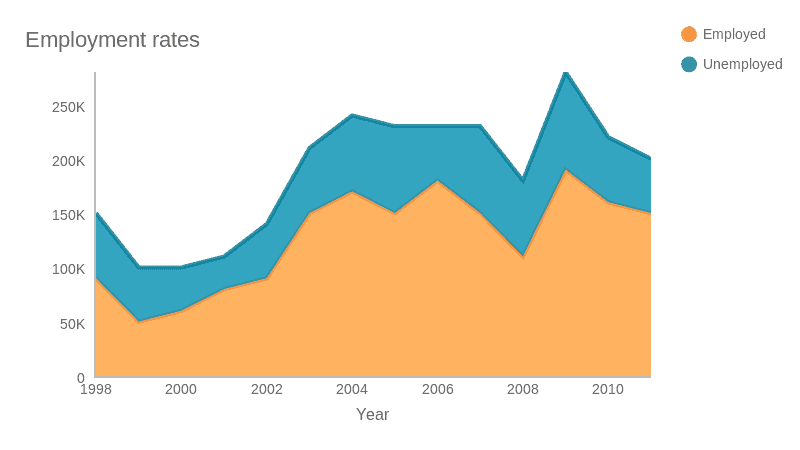
The height of each area represents the value of each category, whilst the final height is the sum of those values.
In this example, you can see the estimate of employment rates from 1998 till 2010. The colors (blue and orange) differentiate each category.
In Stacked Area Charts, you can also find Percent Stacked Area Charts.
Just like in the Stacked Area Chart, several areas are stacked on top of one another in the Percent Stacked Area Charts, and a third variable is represented.
Each area indicates the percentage of each part, referred to as the total of the category.
Here is an example of how a Percent Stacked Area Chart should look like:
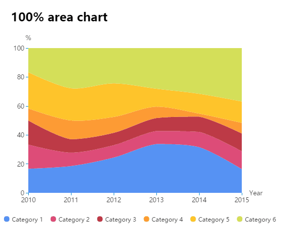
As you can see, the final height of the vertical axis is always 100%, and it ranges from 0 to 100%.
The height of each Stack indicates how the percentage (%) of each category changes over time.

The Best Uses for Stacked Area Charts
As with many other visualization types in Power BI, this type of area chart must be used considering the information that you want to display. Especially if you don’t want to be misleading. As eye-catching as they might be, sometimes they can be difficult to read and interpret.
Stacked area charts are your way to go when you need to show multiple data with a part-to-whole relationship, or when you need to present a cumulative series of values. Like we mentioned before, they are great for composition analysis. As a visualization type, stacked area charts allow you to show how each category plays its part in the cumulative total. They are great if you need to study the changes of the whole and the relative proportions of each group.
Warning note: Please note that Stacked Area Charts are not appropriate to interpret the changes of each individual group in the cumulative total. Why? Because it is very hard to subtract the height of other groups at every single point of the chart.
Recommendations: What can you do instead? When you find yourself in this situation, you can rely on other visualizations, like a line chart, for example –they are not as fun to look at as the stacked area charts, but they display data in a simple and effective way that is easy to read and interpret.
What to consider when creating a Stacked Area Chart?
Use an appropriate color palette
Sometimes, it is difficult to visually process information in a Stacked Area Chart because visuals can be misleading.
Normally, you set your sight at the top values of each line. However, as each line follows the baseline of the line below it, hence the areas are influenced by the lower one. In this way, every trend is similar to the trend below it.
This is why you should always keep in mind that colors need to be used carefully. Use an appropriate color palette, because more than four or five levels of Stacking require a lot of visual processing, and sometimes it might create confusion!
Consider the ‘Order of Lines’ in a Stacked Area Chart
To support a good visualization, you need to choose the line order carefully.
Put the largest or most stable groups at the bottom and the most variable (or smallest groups) on top. This will make your chart visually appealing.

How to create a Stacked Area Chart using Power BI? (A Step-By-Step Guide)
Now that we have covered the basics about Stacked Area Charts, let’s move on to creating Charts using Power BI.
Step 1: Creating a Chart
The first thing you need to do to create a Stacked Area Chart in Power BI is to Select the “Stacked Area Chart” under the Visualizations Section and click it.
Once you click on the Stacked Area Chart, a dummy (aka no data) visualization will be created automatically; like the screenshot below shows:

Step 2: Add the respective information
After creating the dummy, you need to add the information in the following fields:
-
- Axis: Axis field will have the criteria for segmentation that will run the information layout. In this field, you need to specify the name of the column representing the Stacked Area.
- Legend: This field separates the area of the graph into small Stacked Areas. In other words, it is the field that divides the values.
- Values: In this field, you need to incorporate relevant information that is going to be displayed on the chart: sales amount, order quantity, total sales, etc.
- Tool Information: This field is used to set up content that is going to be displayed on the floating window.

Step 3: Add information in the Value Field
Drag the respective information from the “Fields Section” to “Values Field”.

Step 4: Add name in the Axis Section
After adding information in “Values Field”, you must add the name in the “Axis”. You can do this either by dragging it from the “Field” section to the “Axis” section or by clicking the checkmark in the “Field” section.

Step 5: Add colors and be creative!
This is the part where you let your creativity and good criteria flow! By default, the area chart fills the space between the axis and line with default colors. To change it, you can click on “Format” and then click on “Data colors” to choose the colors you prefer.

That sums it all up!
Now you can start creating your own visuals in Power BI, and we hope that you have found this article helpful to start with your own Stacked Area Charts. Keep in mind that practice makes everything perfect.
CONCLUSION: Microsoft Power BI Stacked Area Charts
From explaining the Power BI to the different types of Stacked Area Charts, we hope that you could learn more about the visuals in Power BI with us.
Thank you for reading Part 2 of our Power BI Series. For more information and learning, browse our website.
If you have any questions about this topic, you can leave them in the comments below. You can also directly reach out to us here. – Brandon Ahmad, founder of Instructor Brandon and Dynatuners.

