Consulting, Development, Microsoft Dynamics AX
Tutorial: Understanding the Simple List & Details form within Dynamics AX 2012r2 Part 2
 15756
15756 
Apr
In Part 2, we add our form design. Here you will learn the Dynamics AX way of dealing with fundamental components like tabs, lists, containers, details, and grids. You’ll even do some minor customization to the action menu. While the tutorial has been made purposely simple for introductory learning, it’s a great start to learning the Dynamics AX way.
Scenario: Your users want to be able to view multiple records in a table and edit them at the same time. Enter our hero, the simple list and details form.
What You Need: In order to do this demonstration, you need the free Dynamics AX 2012r2 image provided by Microsoft and on Partner Source. You will also need to have completed Part 1 of this series.
-
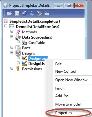
Within the SimpleListDetailExample project, expand the Designs node and right click on the Design node. Select Properties. The Design (not Designs) sub-node is where we do the majority of our form layout design. While we can do drag and drop in MorphX like a .NET Windows development tool, the preferred way is to add things to the Design node in the way that I will be displaying here. This is because MorphX is very good at positioning controls for us. Learn to accept the benefits of automatic behaviors within MorphX. It will make things easier to just let the tool do what it does best.
-
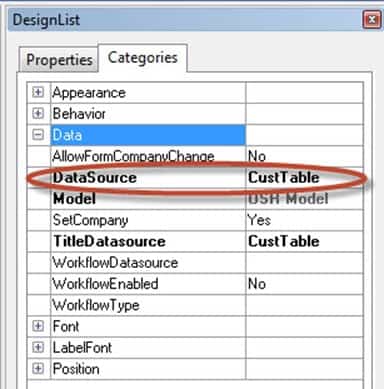
In the properties box, change the DataSource Property to CustTable. Change the TitleDataSource property to CustTable. Setting the DataSource property is required as this is how you map your design to the actual data. Setting the Title Data Source is highly recommended except for 3 cases, one of them here. You can leave this property alone on SimpleList, SimpleList and Details, or a Table of Contents template. The Title Data source just makes the table name appear as a label followed by a dash like this: [Customers – Customer Account: 4010, The Lamp Shop].
-
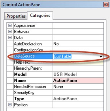
Now, think of the action Pane like the ribbon. It’s a panel of menu options. In Dynamics AX, map your Action Pane to a data source and it will auto-populate menu options for you. Of course, this can be customized but this auto behavior is really cool.
Right-click on the ActionPane, left-click on Properties. Set the DataSource to CustTable.
-
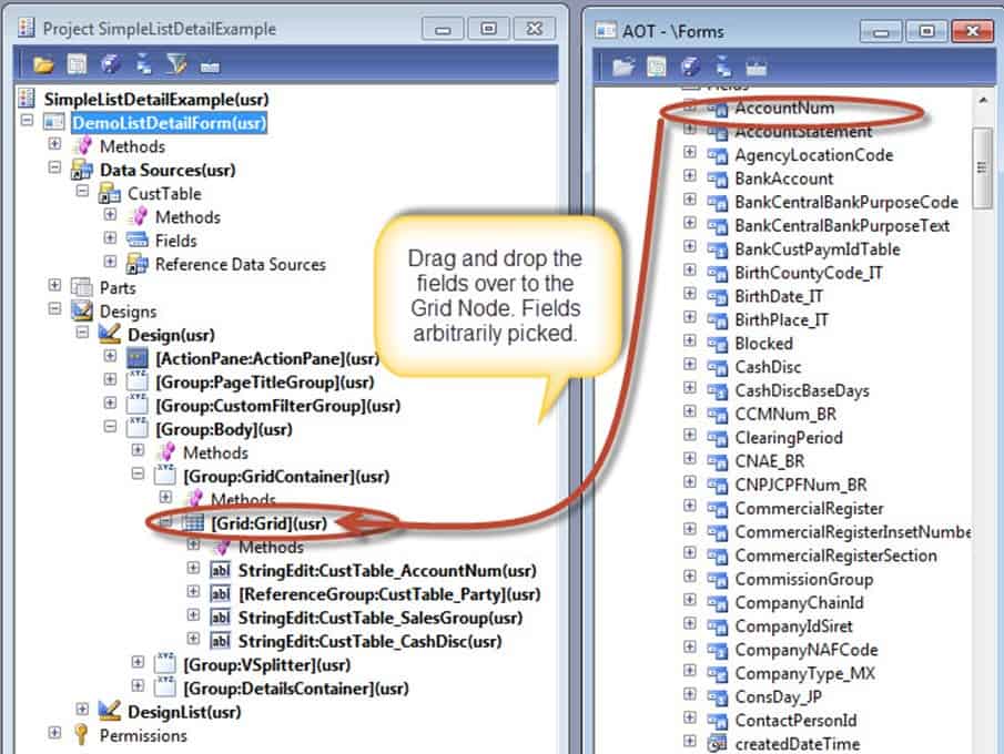
Now, to make this easier, we will need another development window open. More specifically, we’ll need one showing the forms window. If it isn’t already open, right-click on DemoListDetailForm within your SimpleListDetailsExample project window, and select Open in New Window. At any rate, you should have two windows looking like this:
-
Using drag and drop by highlighting fields and using the mouse, drag the following fields from Data Sources/Fields over to the [Grid:Grid](usr). You will do this by dropping the fields on the [Grid:Grid](usr). The following fields need to be added:
Party, AccountNum, SalesGroup, and CashDisc. Adding 2 fields here is best but anything less than 4 is okay. The idea is to keep the number of fields short because you just want to show the user what is necessary to identify the row. They will be able to look to the right to get the details for each row.
- Right-Click on [Grid:Grid](usr), select Properties, and change the MultiSelect property to No. Make sure that the DataSource property is set to CustTable. This will map the grid to the right table and also prevent users from selecting more than one row at a time for editing.
-
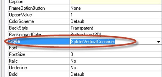
Right-Click on [Group:Body](usr) and choose Properties. Change the Style property to SplitterVerticalContainer.
-
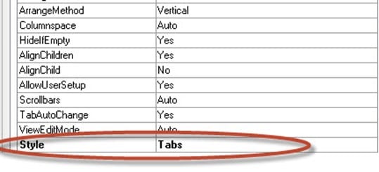
Expand the Design node, expand the [Group:Body](usr), expand the [Tab:DetailsTab](usr) group. In the property sheet for the tab control, click the Style property, and then select Tabs for the property. This means that you expect all of the fields to fit on one page which means that there aren’t many fields.
-
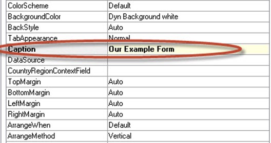
Expand the [Tab:DetailsTab](usr) and then click the tab page with the [TabPage:TabPage](usr). Click the properties option and set the Caption property to Our Example Property. Now, you will be able to see a caption in the form when it runs.
-
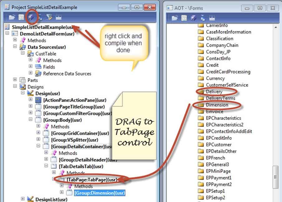
Now drag the Dimension folder and the Delivery folder over to the [TabPage:TabPage](usr). Note: the dimension folder and Delivery folder are known as field groups. Field groups are related fields that often go together. They are often enclosed by a square so that the user logically knows that these columns are related in some sort of way. A good practice is to define field groups because it makes it much faster to build forms.
Then, click the save all option. Afterwards, compile your project and run it.
-
And finally, let’s see how everything looks. Right-Click on the DemoListDetailForm and click Open to preview the form.
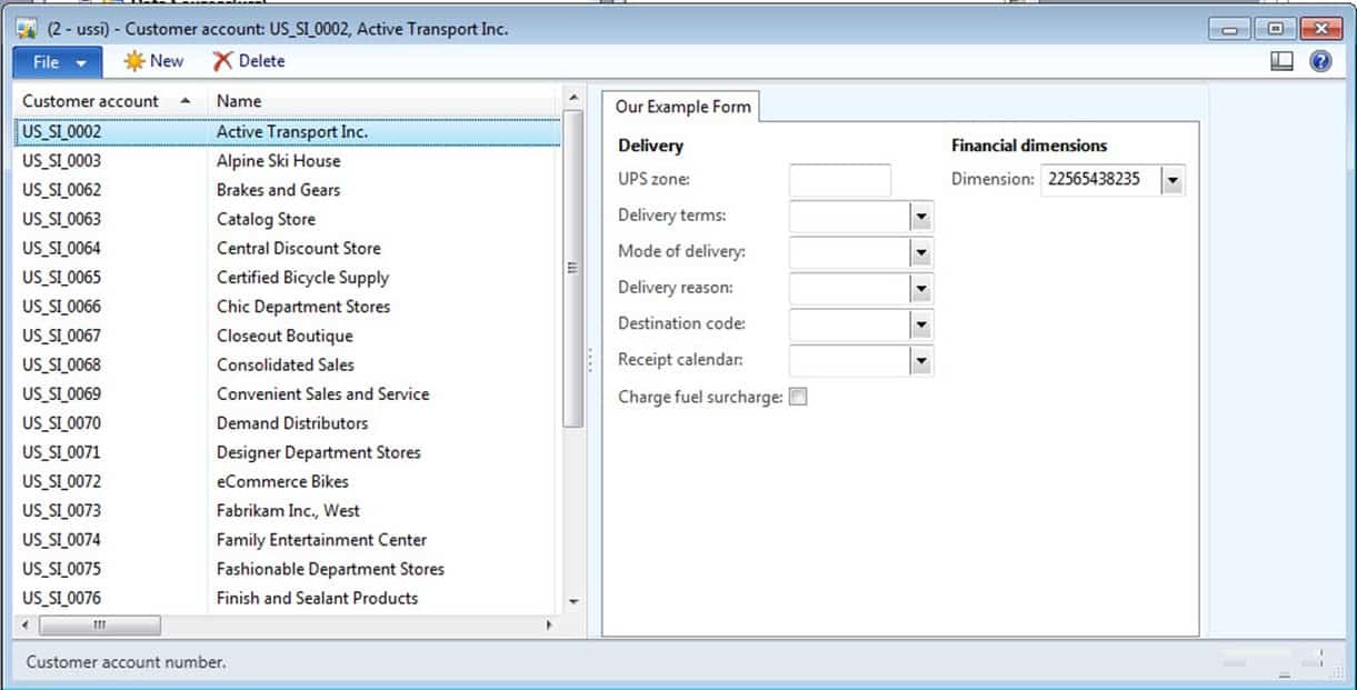
And congrats! If you have done this tutorial, you’ve learned how to make a form in MorphX. You used on particular template to display a grid on the left and a tab page on the right. You were exposed to various properties and best practices also. Hopefully, this gets you pretty hyped up about MorphX development! It’s an amazing development environment.
